

Rebuild. Redefine.
Ride & Rise.
Ground Zero Indoor Cycling Studio
Brand Strategy & Identity
Fitness
Bold, Futuristic
Project ScopeIndustryStyleThe ChallengeIndoor cycling studios are often associated with dark rooms, intense workouts, and an exclusive fitness culture that can feel intimidating to newcomers. For many, simply walking through the doors can feel like the hardest part.
As the first rhythm-based cycling studio in Aseana City, Ground Zero wanted to redefine that experience. The challenge was to create a brand that felt powerful without being intimidating—a place where beginners and seasoned riders alike could feel welcomed, supported, and empowered to start again. It needed to capture the energy of a high-intensity ride while reinforcing the studio's deeper message: every ride is a fresh start.
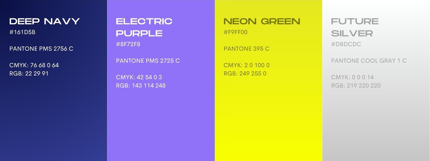
The solutionWe created a bold visual identity inspired by movement, light, and transformation. Futuristic metallic textures and luminous gradients bring the concept of "lighting up from within" to life, while a vibrant palette of electric blue, neon yellow, silver, and deep purple evokes the energy of the studio without relying on the aggressive visual language often seen in the fitness industry.
Dynamic typography, glowing graphic elements, and motion-inspired layouts communicate momentum and progression, creating a brand that feels energetic yet approachable. Rather than emphasizing competition or perfection, every touchpoint reinforces Ground Zero as a space for growth, resilience, and renewal.
The result is a brand that feels more like a movement than a gym. It captures the excitement of a rhythm ride while reminding people that everyone starts somewhere—and that every time you show up, you're building strength from the ground up.
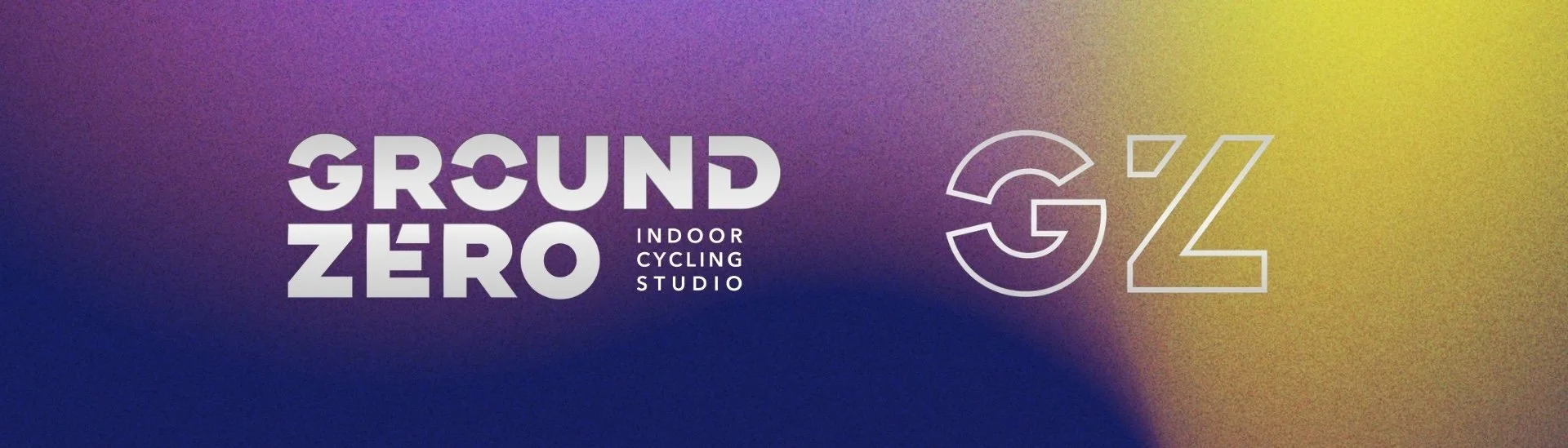
Primary Logo and Brand Mark
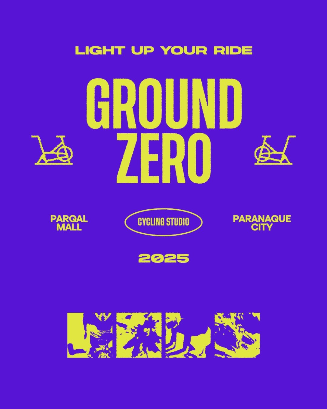
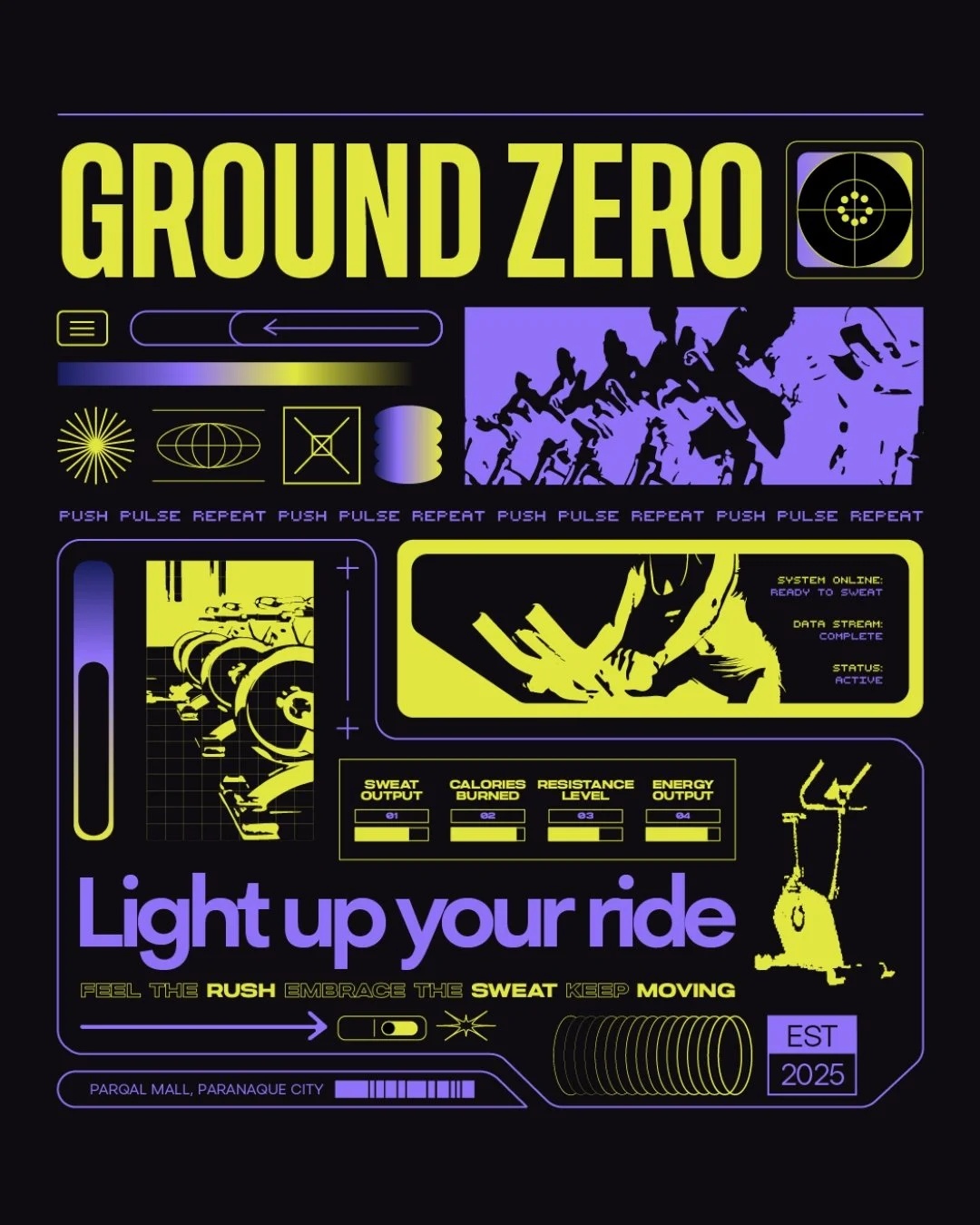
Sample Posters



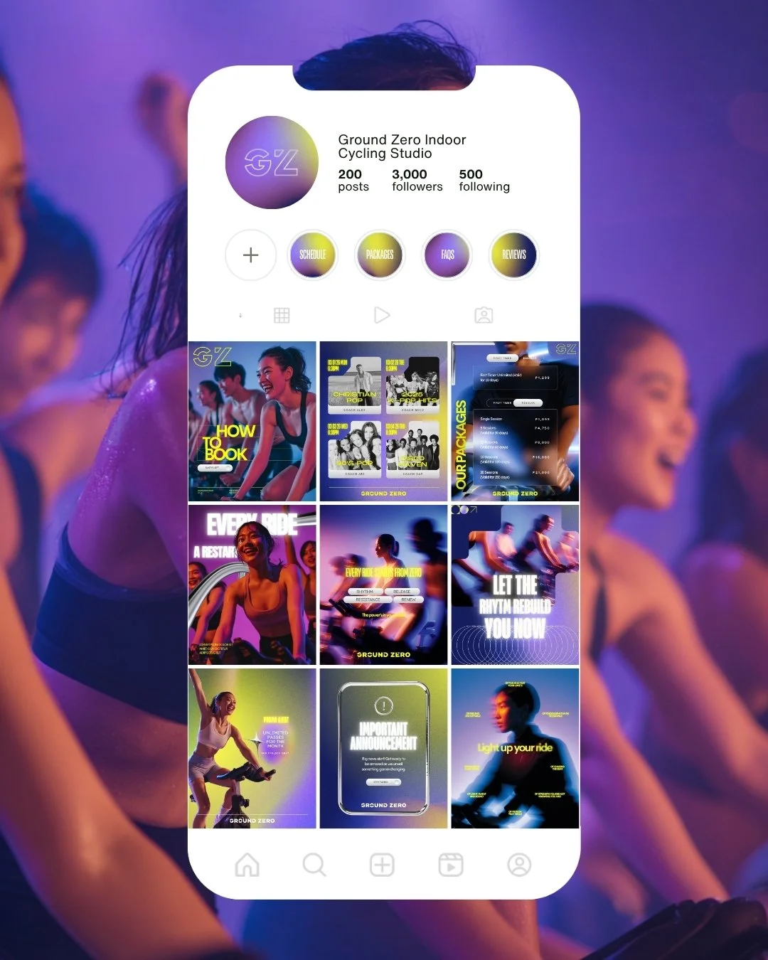
SMM Templates
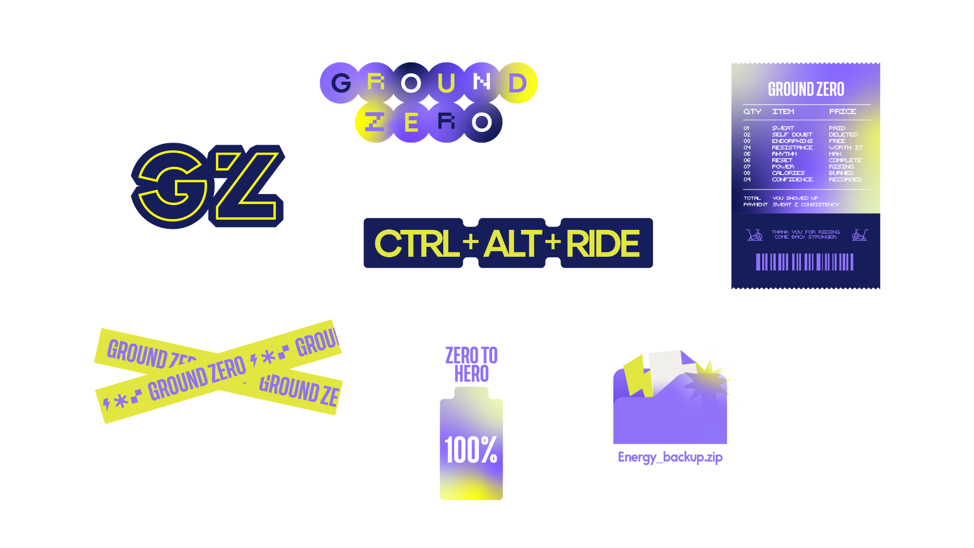
Sticker Pack
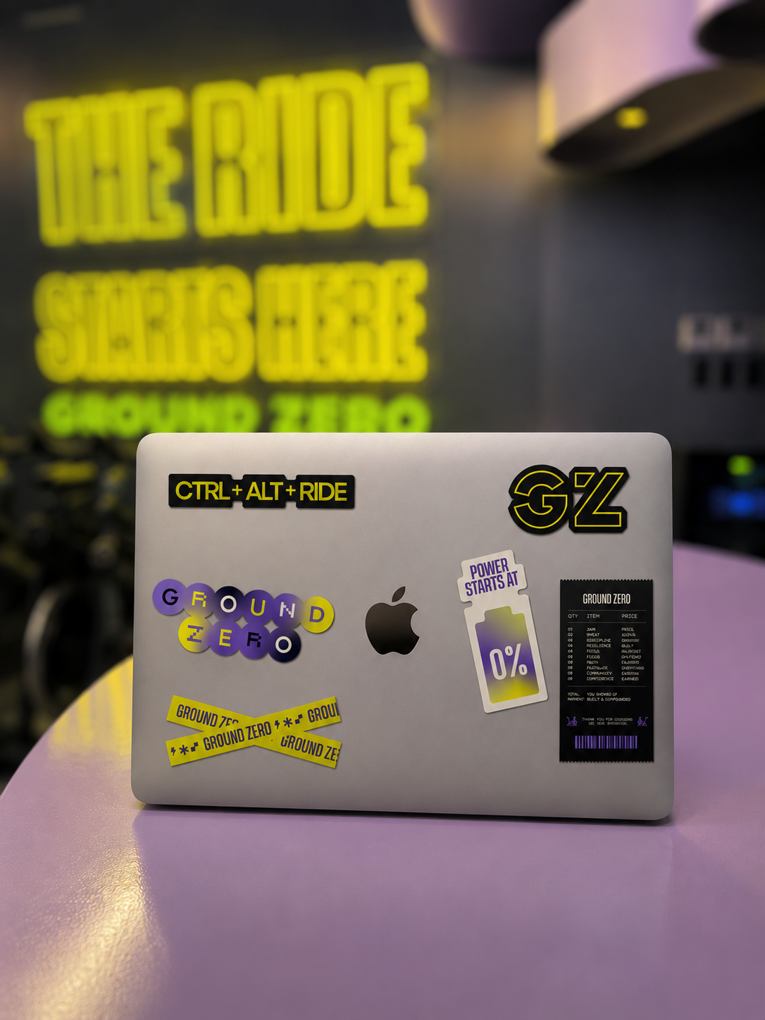
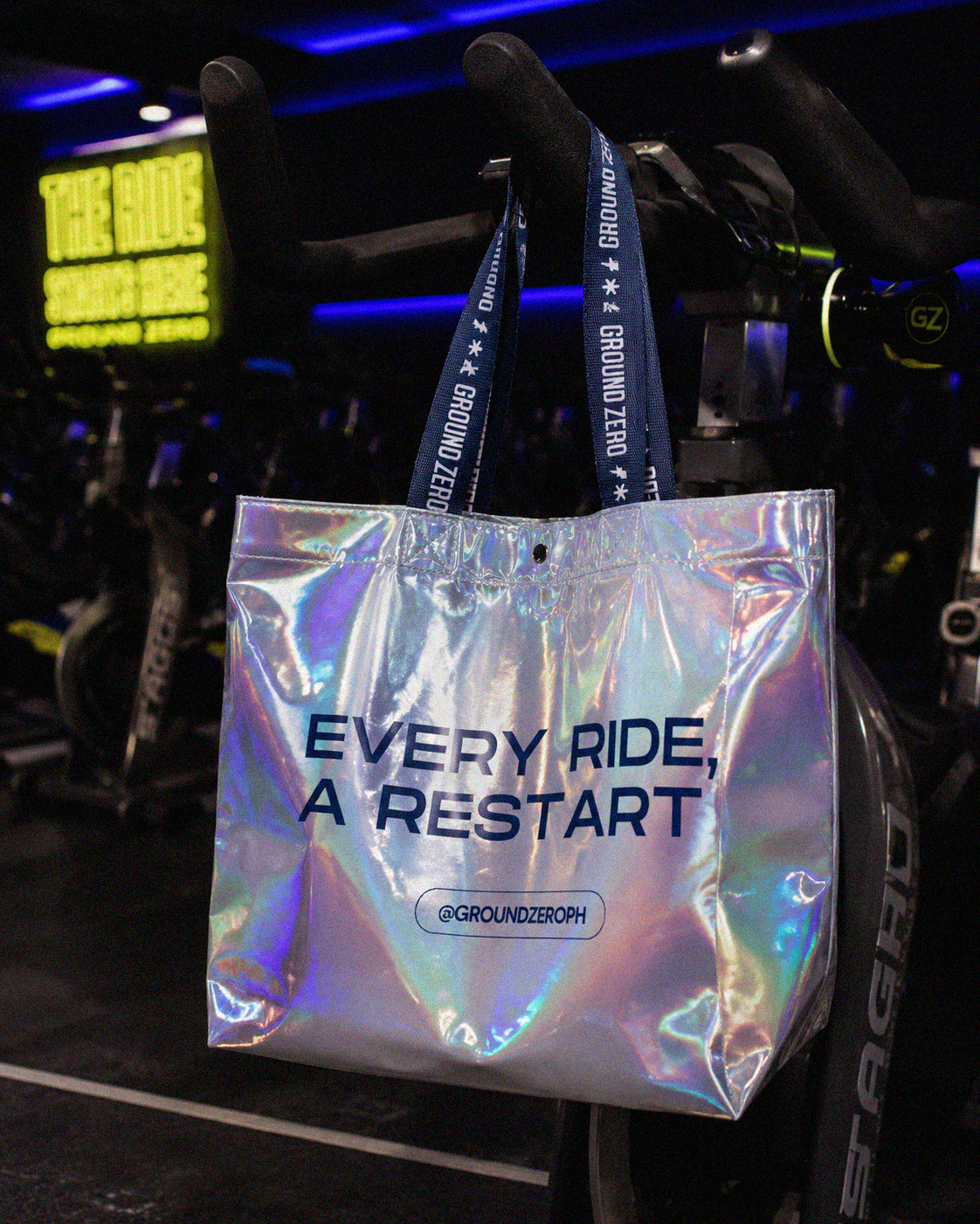
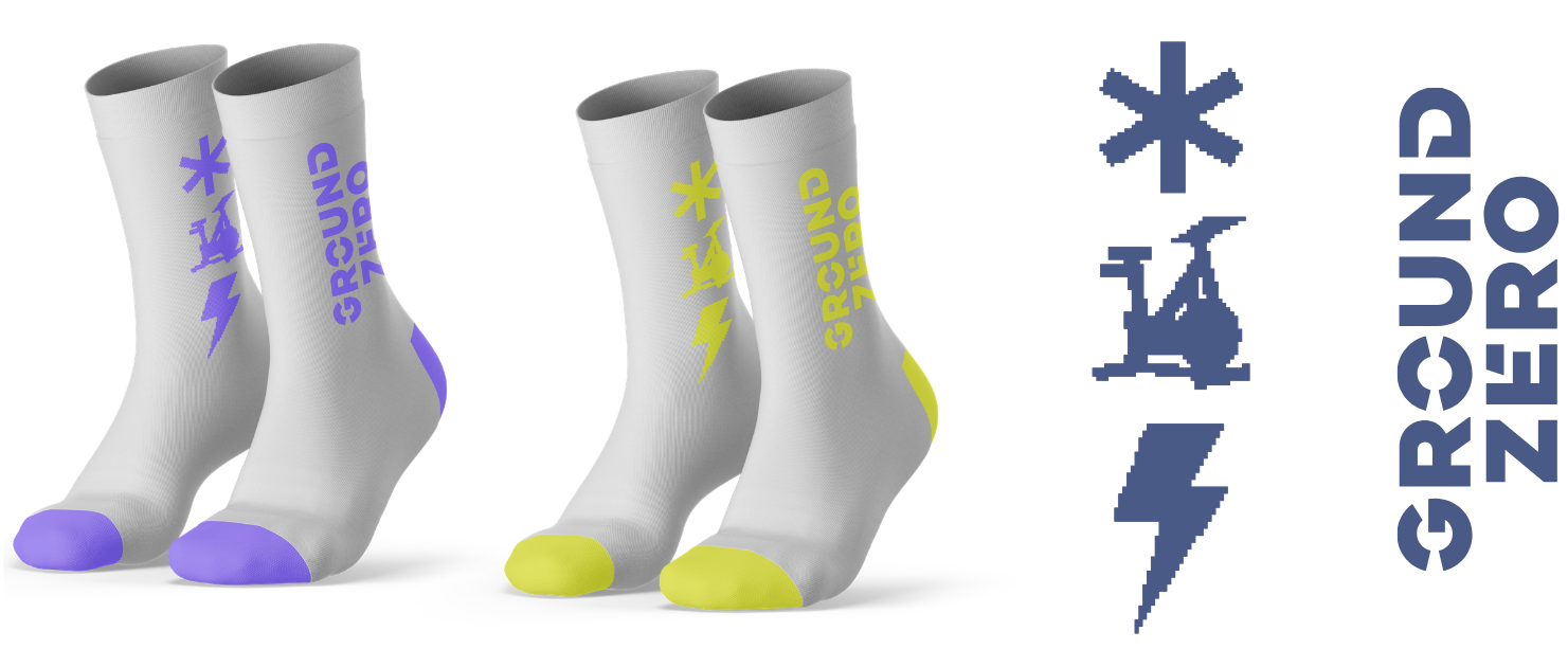
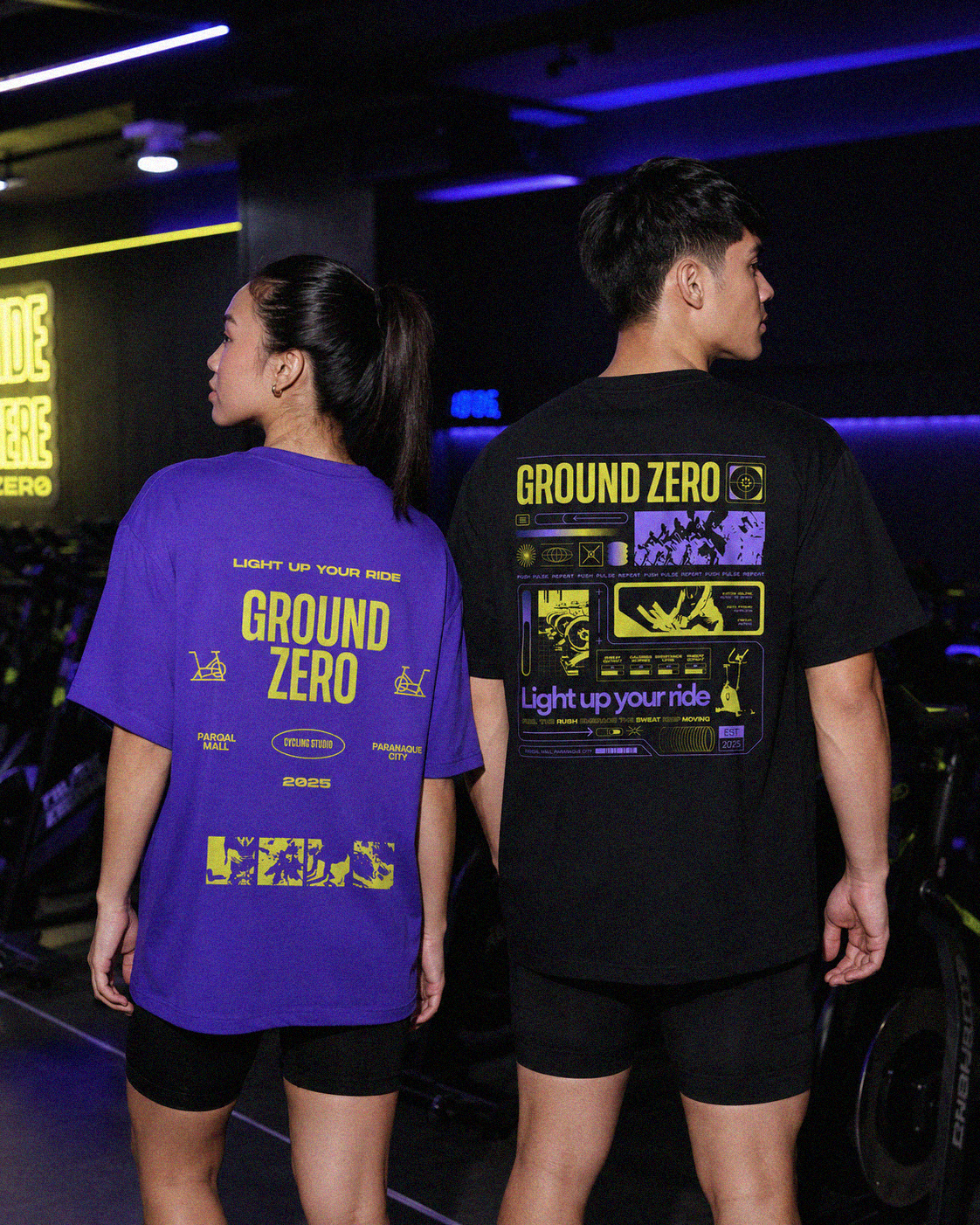
Every piece carries Ground Zero's bold visual language, turning everyday items into wearable extensions of the brand and strengthening the community both inside and outside the studio.
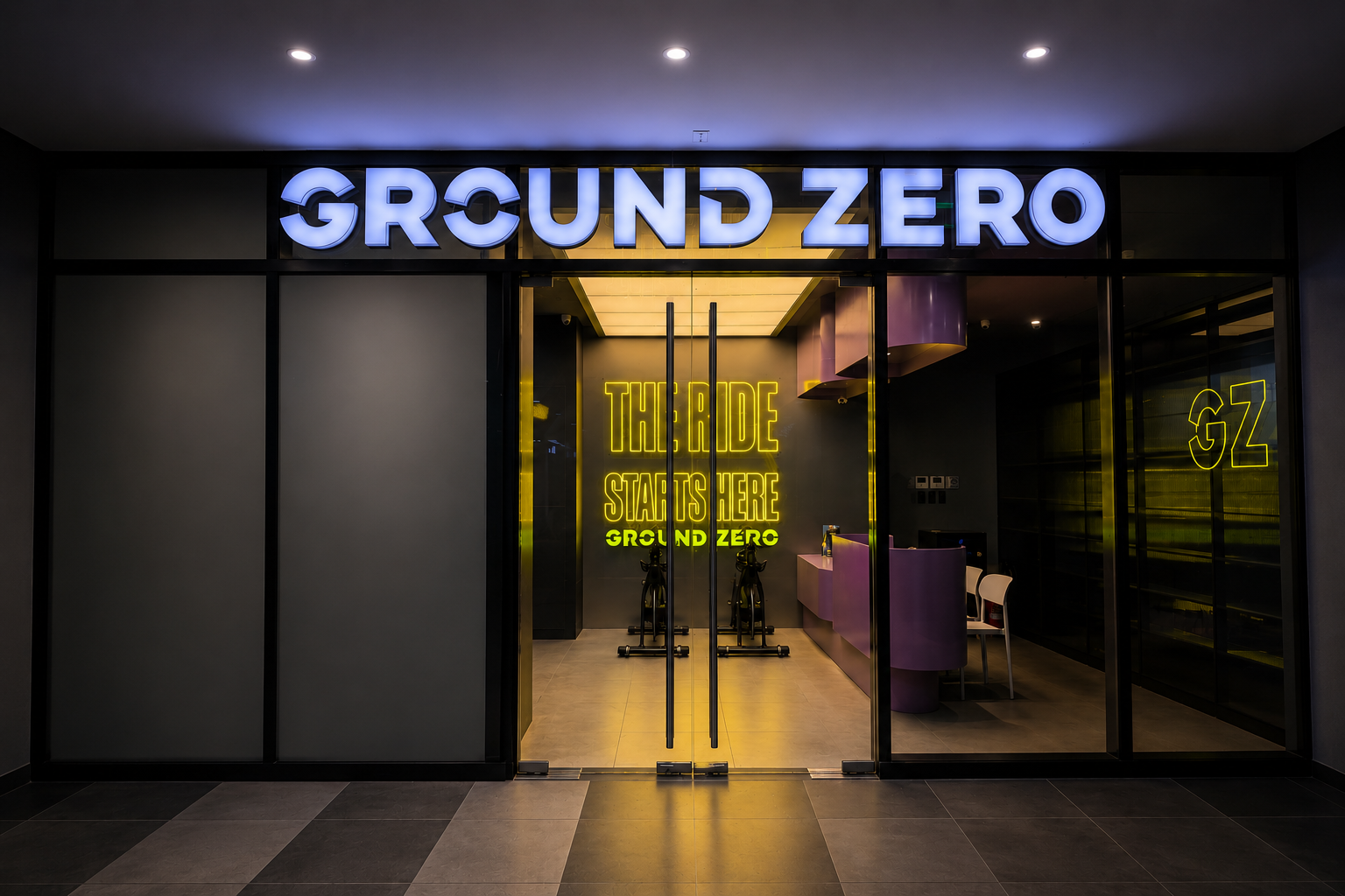
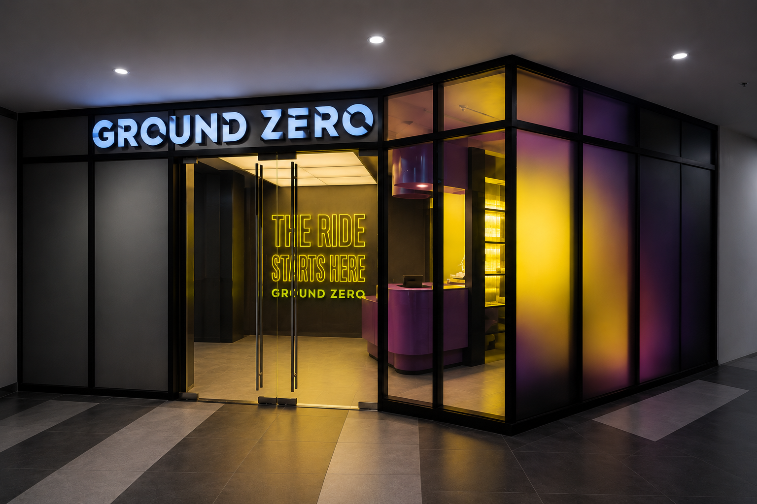
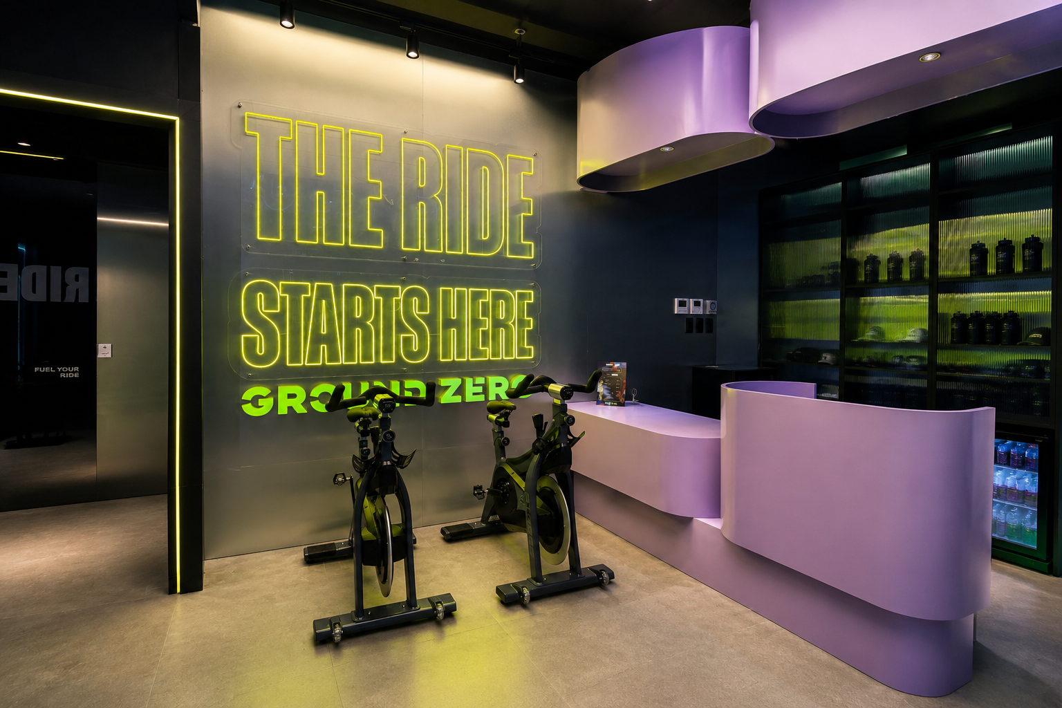
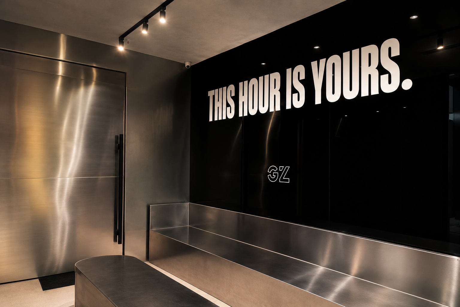
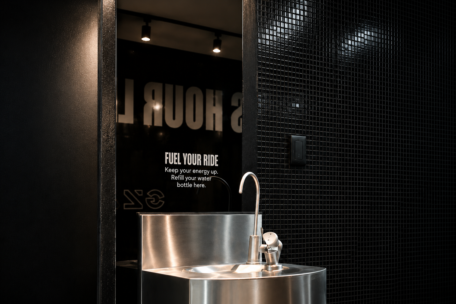
Designed for the First Impression
A brand shouldn't stop at the logo. We extended Ground Zero's identity into its physical environment through custom storefront graphics, signage, and branded interior elements that transform the studio into a cohesive, immersive experience from entrance to ride.
“They helped us achieve the goals we set for our brand through thoughtful strategy and strong execution. ”
Working with Hark Studio has been a great experience from start to finish. They are incredibly easy to communicate with, responsive, and always open to feedback, which makes the entire process smooth and collaborative.
What stood out the most was their excellent execution. They took the time to truly understand our brand, our services, and our goals before proposing ideas.
They are also highly adaptable and quick to adjust whenever changes or new ideas come up, ensuring that everything stays aligned with our vision. Most importantly, they helped us achieve the goals we set for our brand through thoughtful strategy and strong execution. We highly recommend Hark Studio to any business looking for a creative, reliable, and results-driven partner!
- Rosanna, Founder of Ground zero indoor cycling studio and 7AM Pilates studio + cafe|