You Already Glow.
Now, Let’s Show It.
Unswatched Color Analysis Studio
Brand Strategy & Design
Beauty Consultant
Bold, Fun, Sophisticated
Project ScopeIndustryStyleThe ChallengeThe project didn't begin with a logo or a color palette—it began with a question.
The founder came to us looking for a name that could capture a philosophy bigger than color analysis itself. She knew she didn't want to build just another studio that identifies your season, hands you a swatch, and sends you on your way. She wanted a brand that represented something deeper: helping people reconnect with themselves through color.
Our challenge was to create both a name and a visual identity that reflected this belief. It needed to feel modern, thoughtful, and quietly disruptive—challenging the industry's tendency to reduce people to seasonal labels while communicating that confidence isn't something you put on; it's something you uncover.
Visually, there was another layer to solve. A color analysis studio naturally calls for a vibrant palette, but we wanted to avoid creating something that felt childish or overstimulating. The brand needed to celebrate color in a way that felt expressive and joyful while remaining refined, sophisticated, and confidently grown-up.
The solutionWe developed the name Unswatched—a play on color, but more importantly, a statement about authenticity. Inspired by words like Unscripted, Unfiltered, and Unmasked, the name reflects the brand's belief that the journey doesn't end with a color swatch. It begins with seeing yourself more clearly.
From there, we built a visual identity around harmony rather than excess. Instead of relying on loud, competing colors, we curated a vibrant palette where every hue complements the next—capturing the richness of personal color analysis while maintaining a sense of balance and sophistication.
Bold graphic forms, custom icons, and modular patterns add personality and playfulness without tipping into a childish aesthetic. Every visual element was intentionally designed to feel confident, modern, and expressive, proving that a colorful brand can still feel elevated and premium.
The result is a brand that goes far beyond a color analysis studio. It feels vibrant without overwhelming, playful without feeling kiddie, and sophisticated without becoming intimidating. More importantly, it positions Unswatched as a place where clients don't simply leave with a palette—they leave with a deeper understanding of themselves.
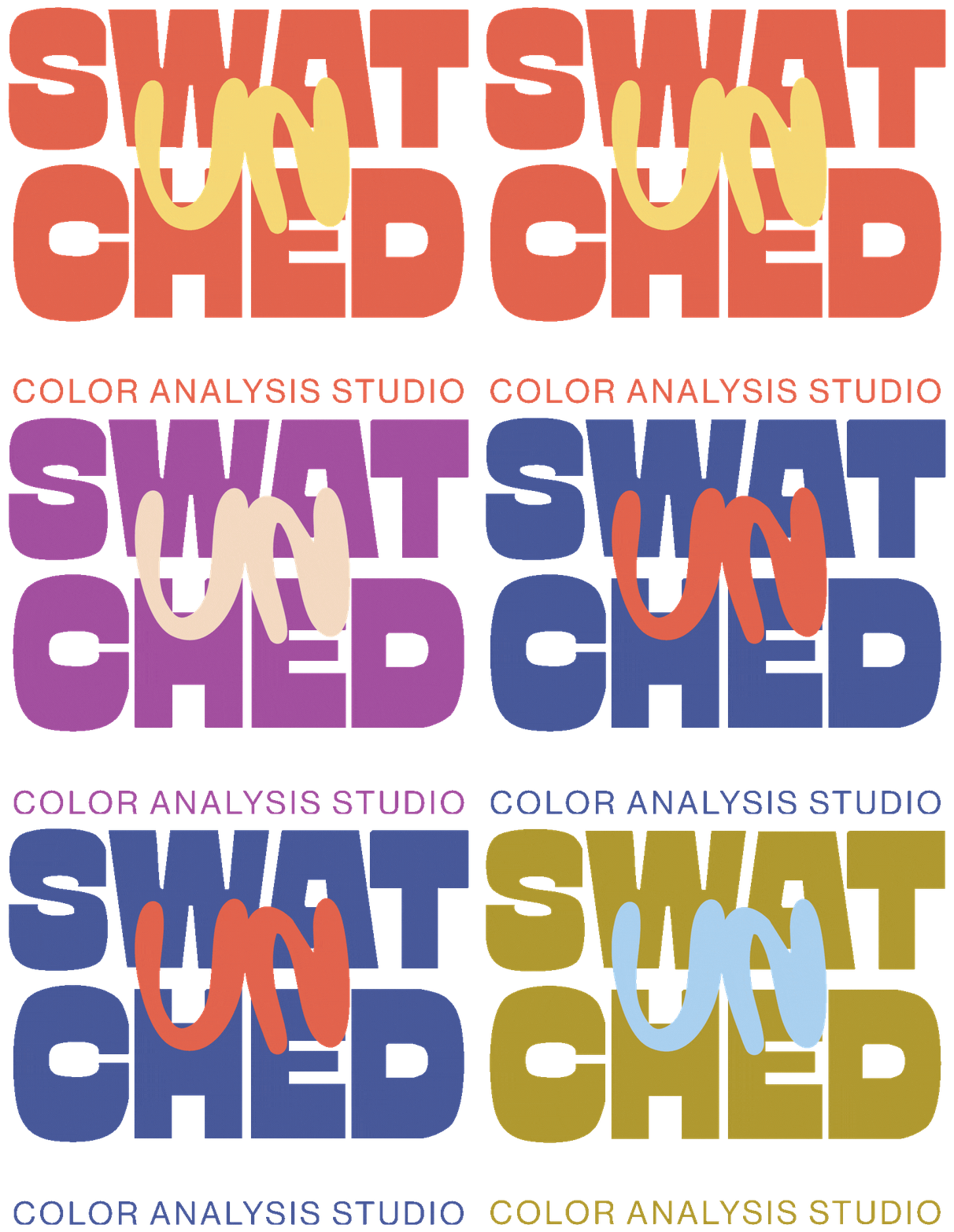
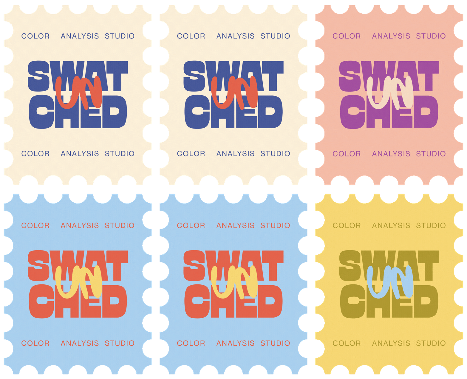
Brand Logos (Primary, Secondary, and Brand Mark)


A Refined Spectrum
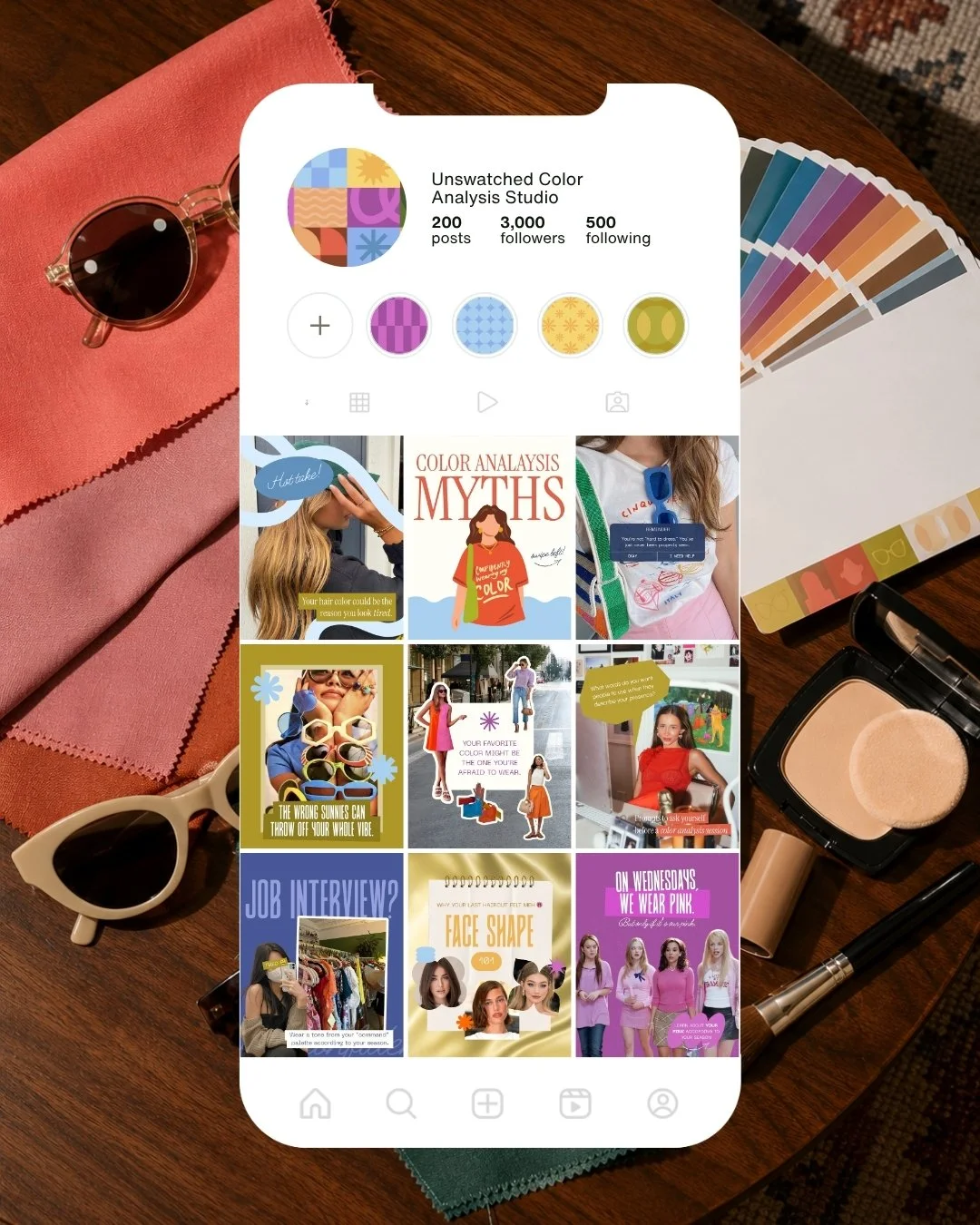
For a color analysis studio, using the full spectrum wasn't optional—it was essential. The challenge was creating a palette that celebrated every color without feeling loud or overstimulating. By carefully selecting softer, more nuanced hues, we crafted a complementary color system that feels expressive yet refined, allowing the brand to embrace the richness of color while maintaining a premium, sophisticated aesthetic.
A Cohesive Client Experience
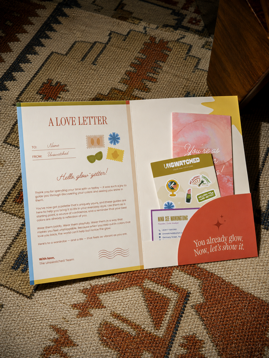
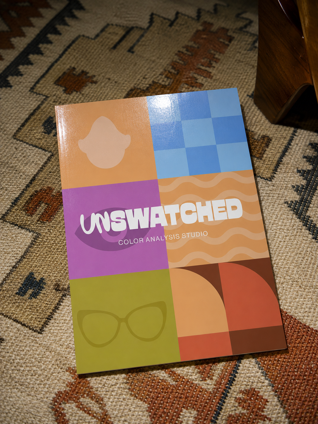
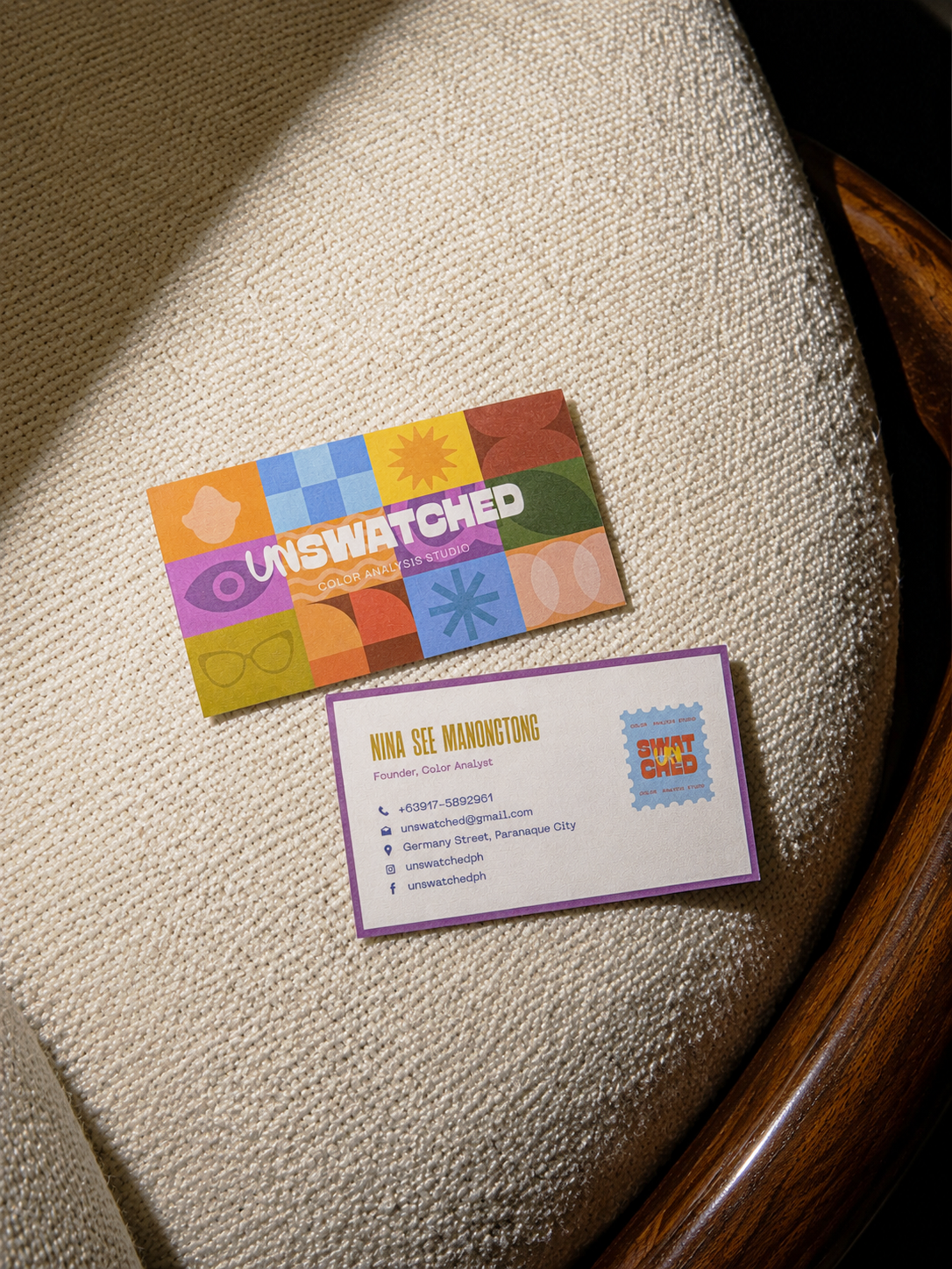
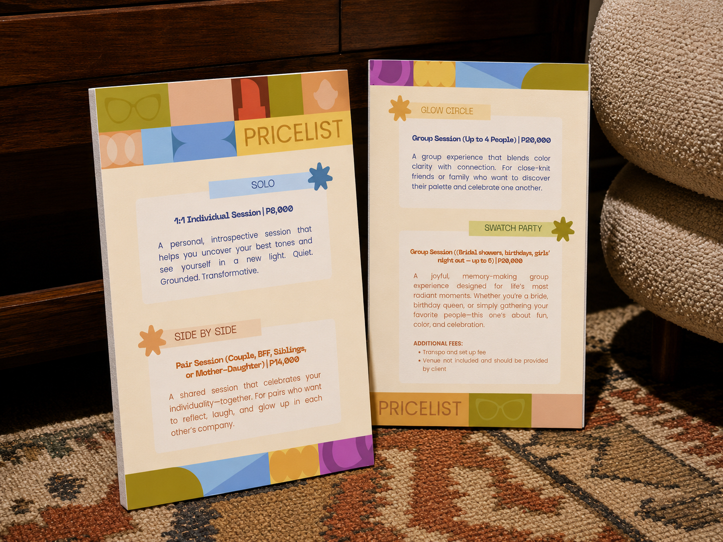
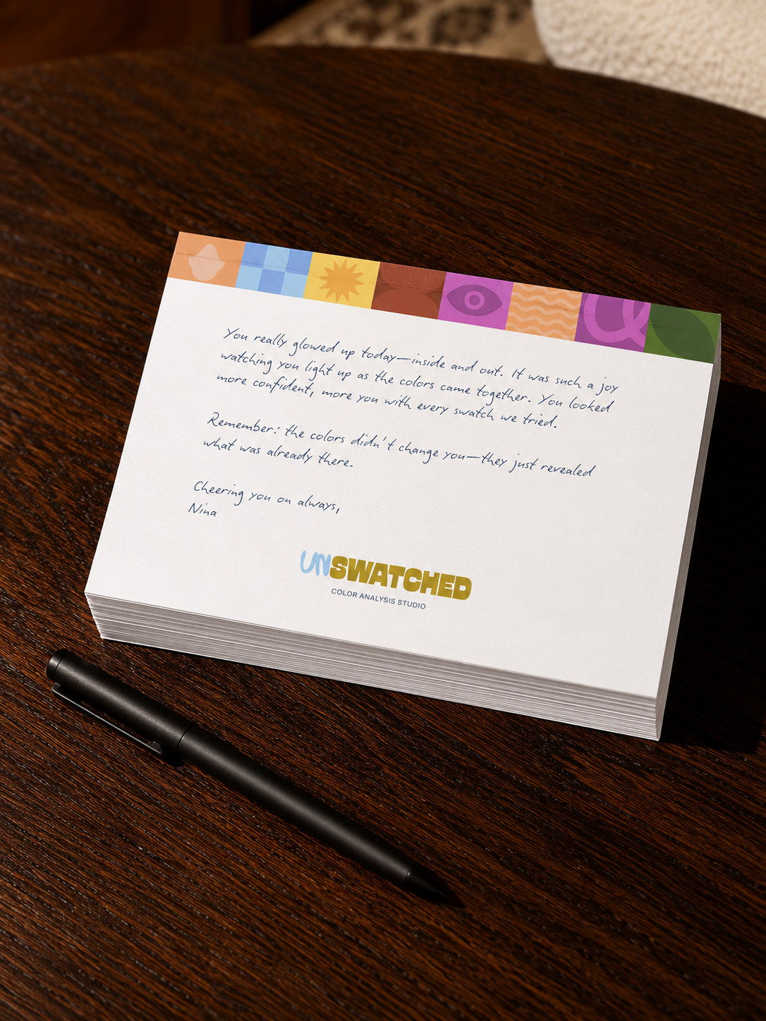
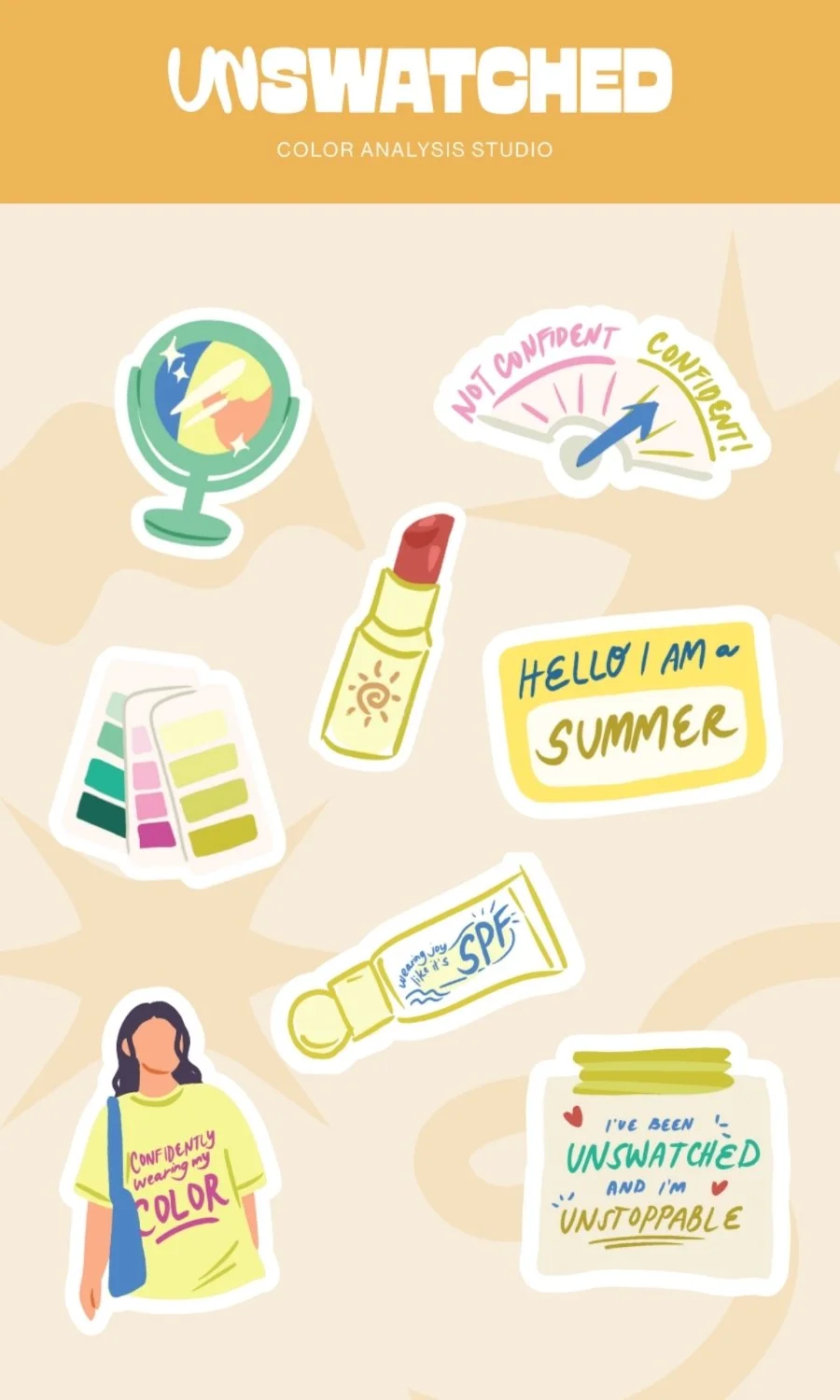
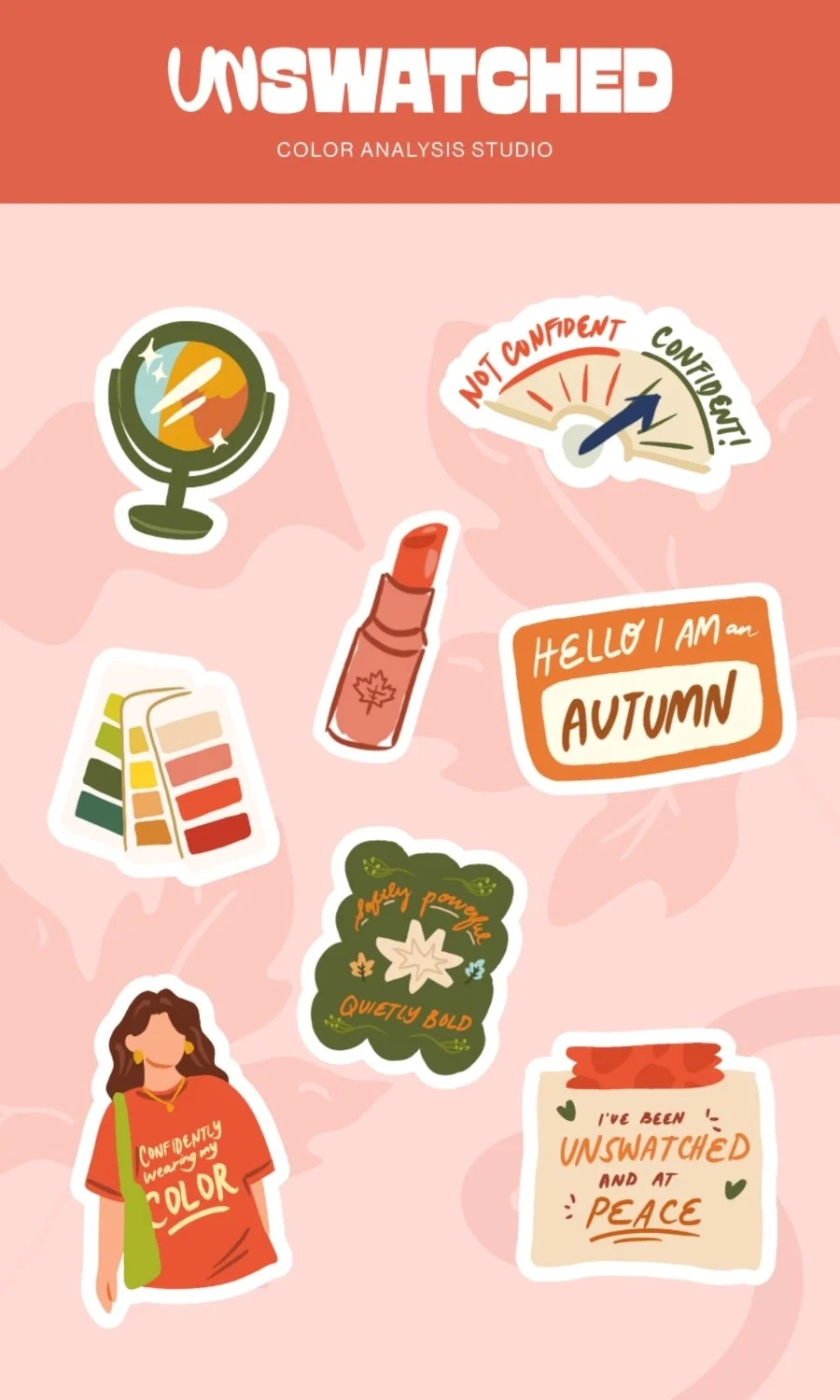
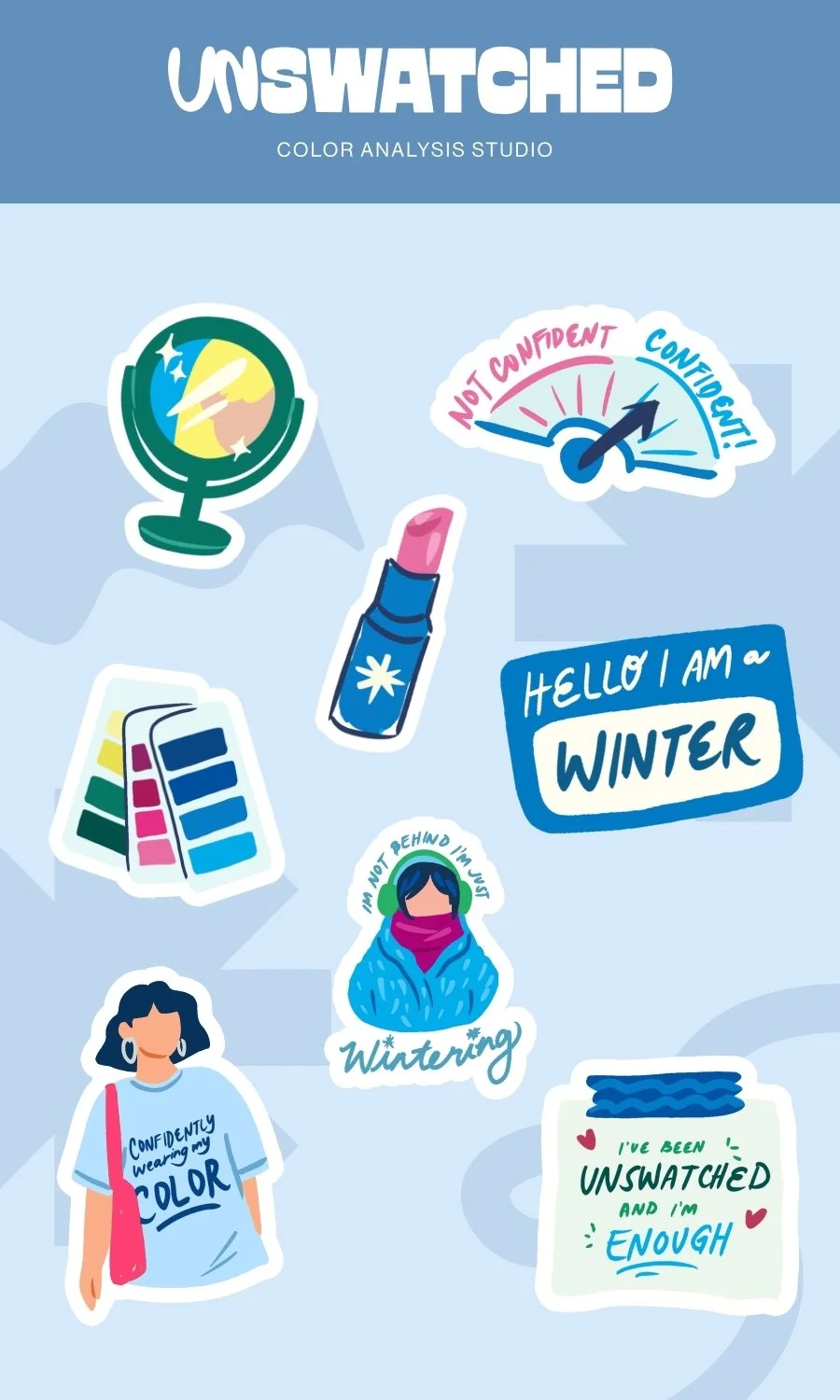
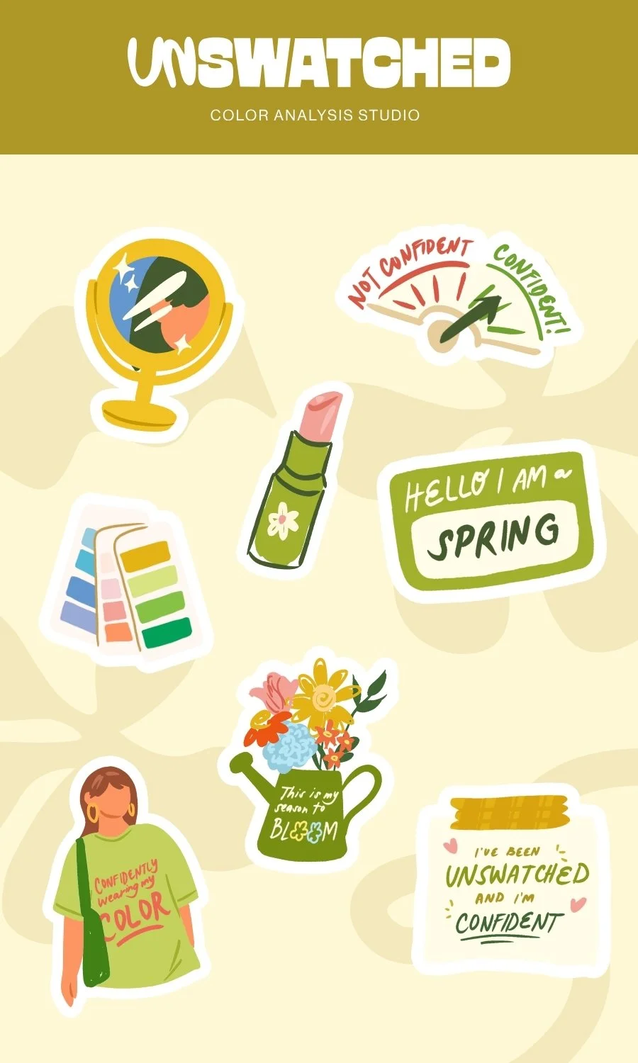
We extended the Unswatched brand into every stage of the client journey, designing a complete suite of branded touchpoints that elevate the consultation experience. From personalized client packets—including a welcome letter, business card, season-specific sticker pack, thank you notepad, and custom swatch guide—to the presentation deck used during each session, every detail was thoughtfully crafted to make the experience feel polished, memorable, and deeply intentional.