
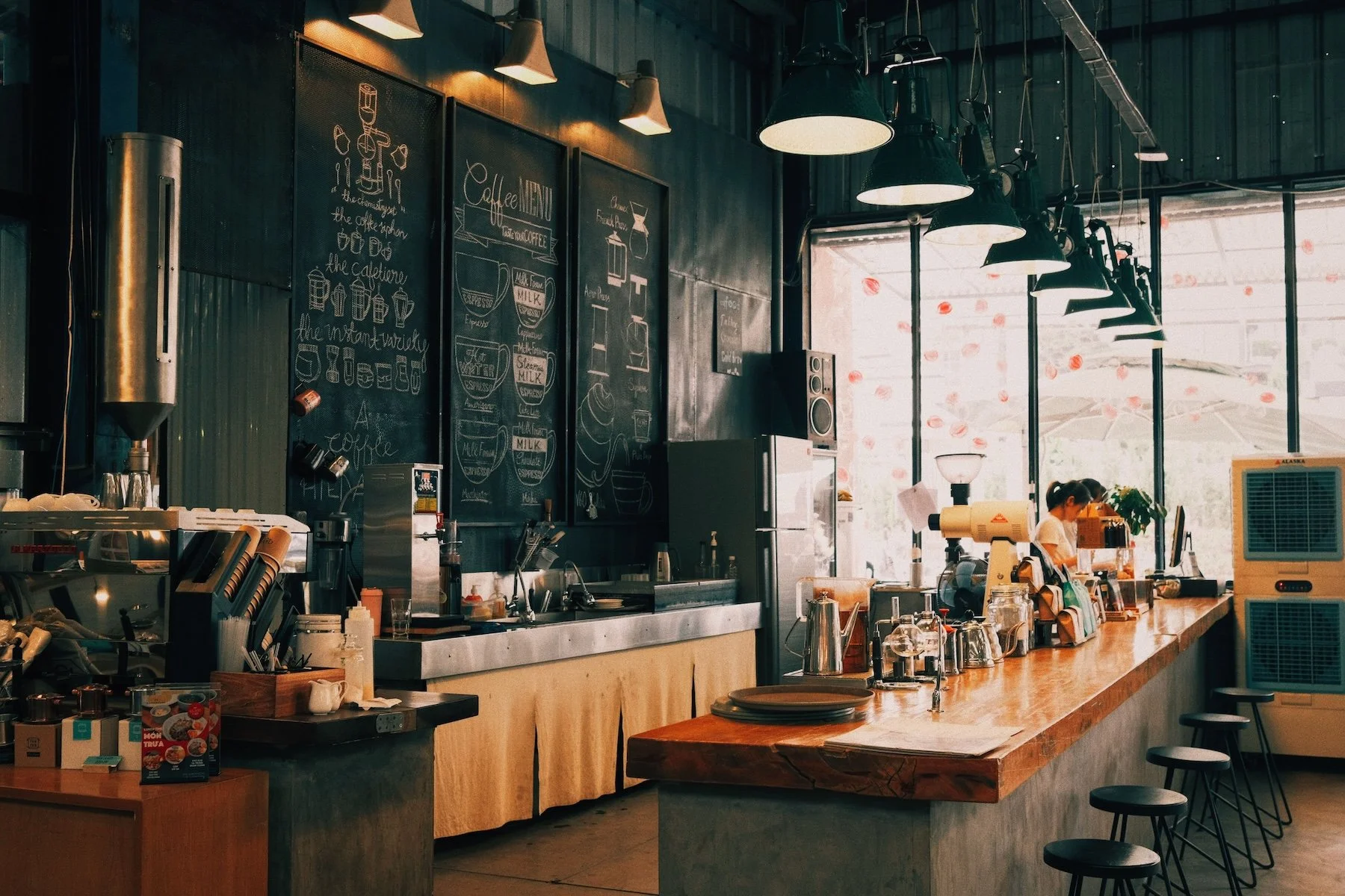
Overflowing Flavor. Overflowing Taste.
Apaw Flavor Cafe
Brand Strategy & Design
Cafe
Playful, Sophisticated, Bold, Youthful
Project ScopeIndustryStyleThe ChallengeIn a city full of aesthetic cafés serving the same menu, Apaw Flavor Cafe set out to do the exact opposite.
From Espresso Tonic and Cherry Lime Americola to Salted Caramel Egg Yolk and Orange Garlic Butter Shrimp, every item on the menu invites customers to step outside the ordinary. The challenge was creating a brand identity that captured this spirit of experimentation without feeling gimmicky or chaotic. It needed to communicate creativity and abundance while still feeling premium enough for serious coffee lovers.
The goal was simple: make people expect the unexpected before they even take their first sip.
The solutionWe designed a visual identity that feels just as bold as Apaw's menu. Rich, unexpected color pairings, expressive typography, and playful layouts mirror the cafe's fearless approach to flavor, while maintaining a refined design system that keeps the brand cohesive and memorable.
Rather than following the minimal aesthetic common among specialty cafés, we embraced visual abundance—oversized typography, layered compositions, and dynamic graphics that evoke the feeling of overflowing flavor and endless possibilities. Every touchpoint was designed to spark curiosity and invite exploration, just like the menu itself.
The result is a brand that refuses to blend in. Apaw Flavor Cafe feels vibrant, confident, and unmistakably original—a destination where every visit promises something new, and every drink or dish becomes a conversation starter.
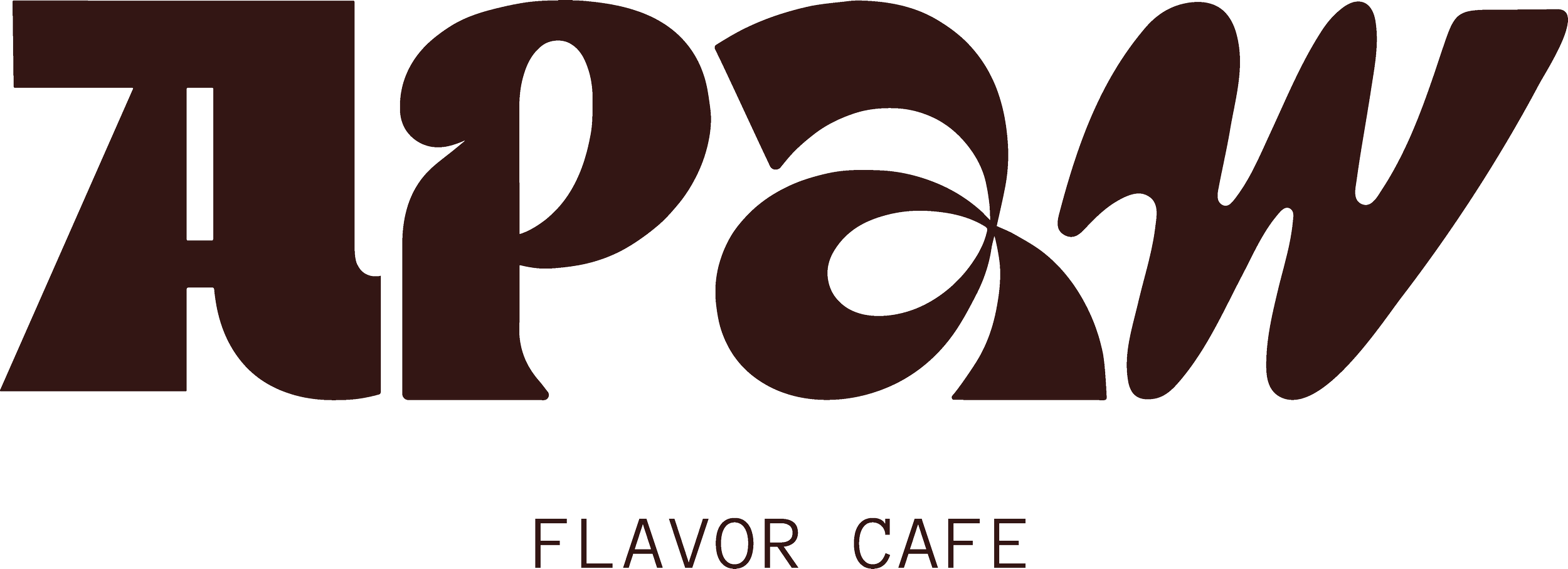
Primary Logo


Secondary Logo and Brand Mark
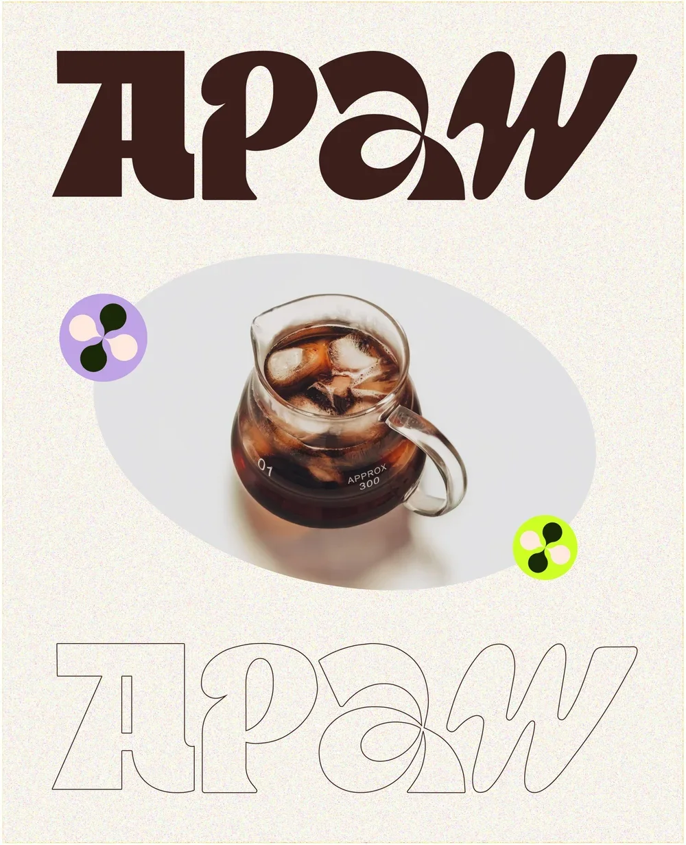
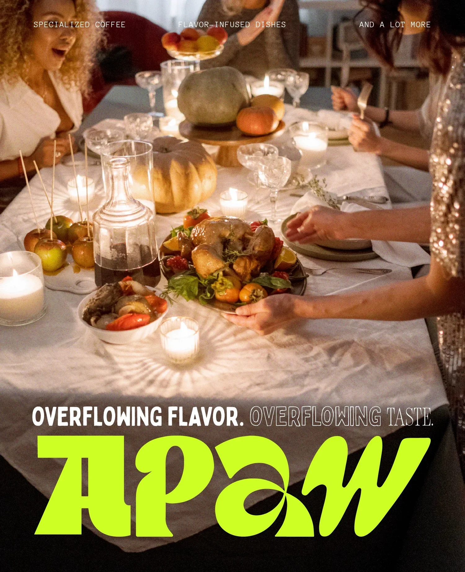
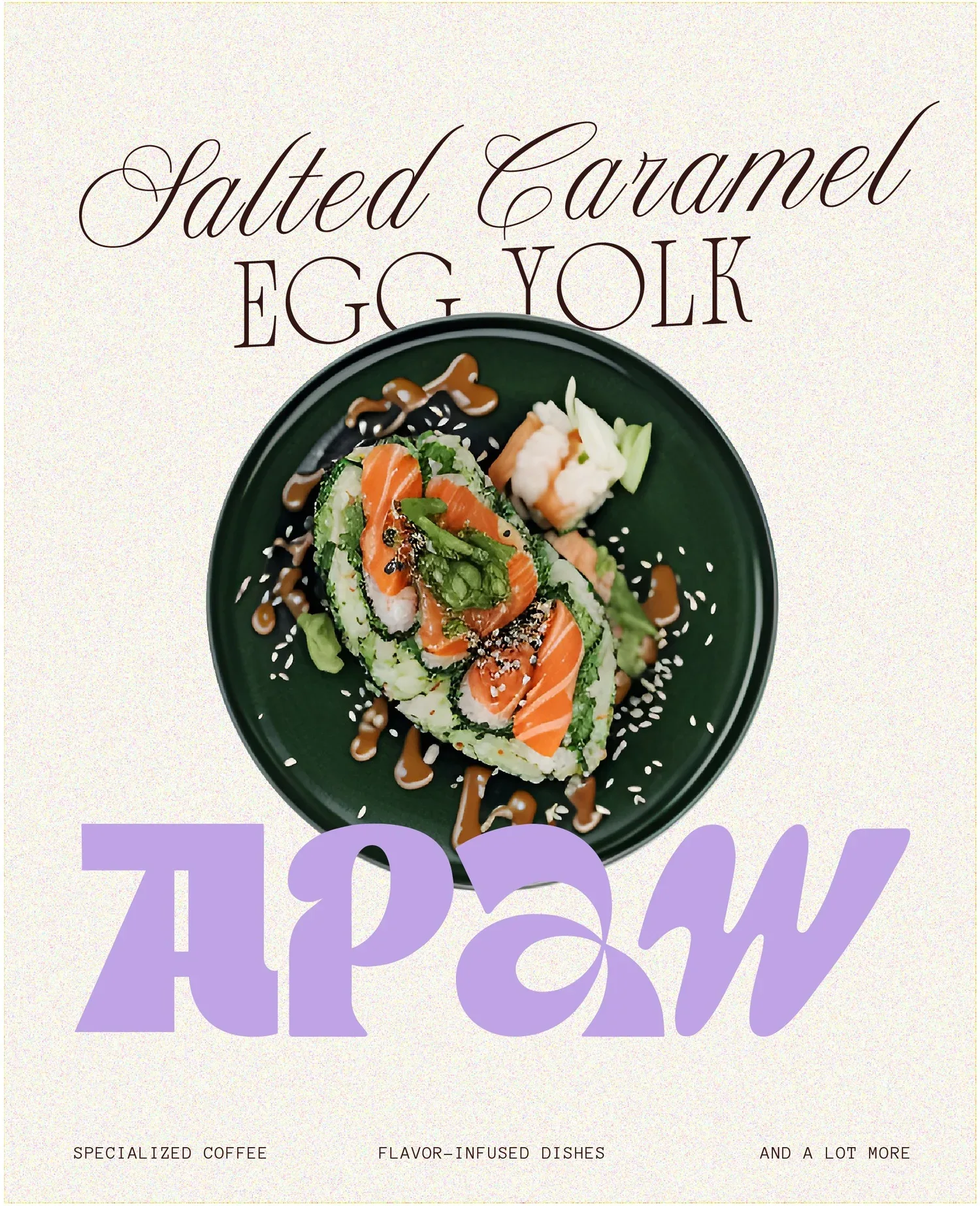
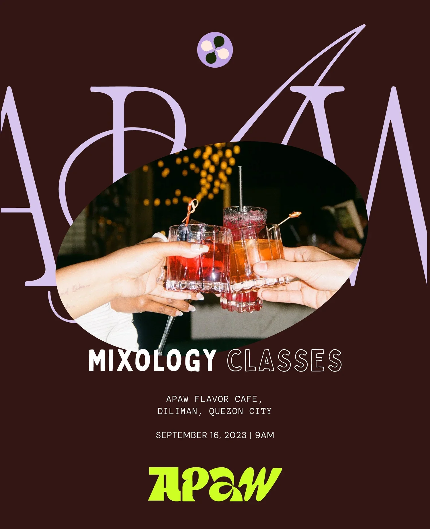
Sample POsters and SMM Templates
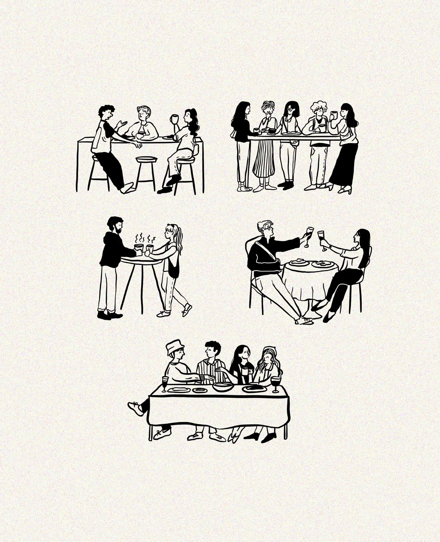
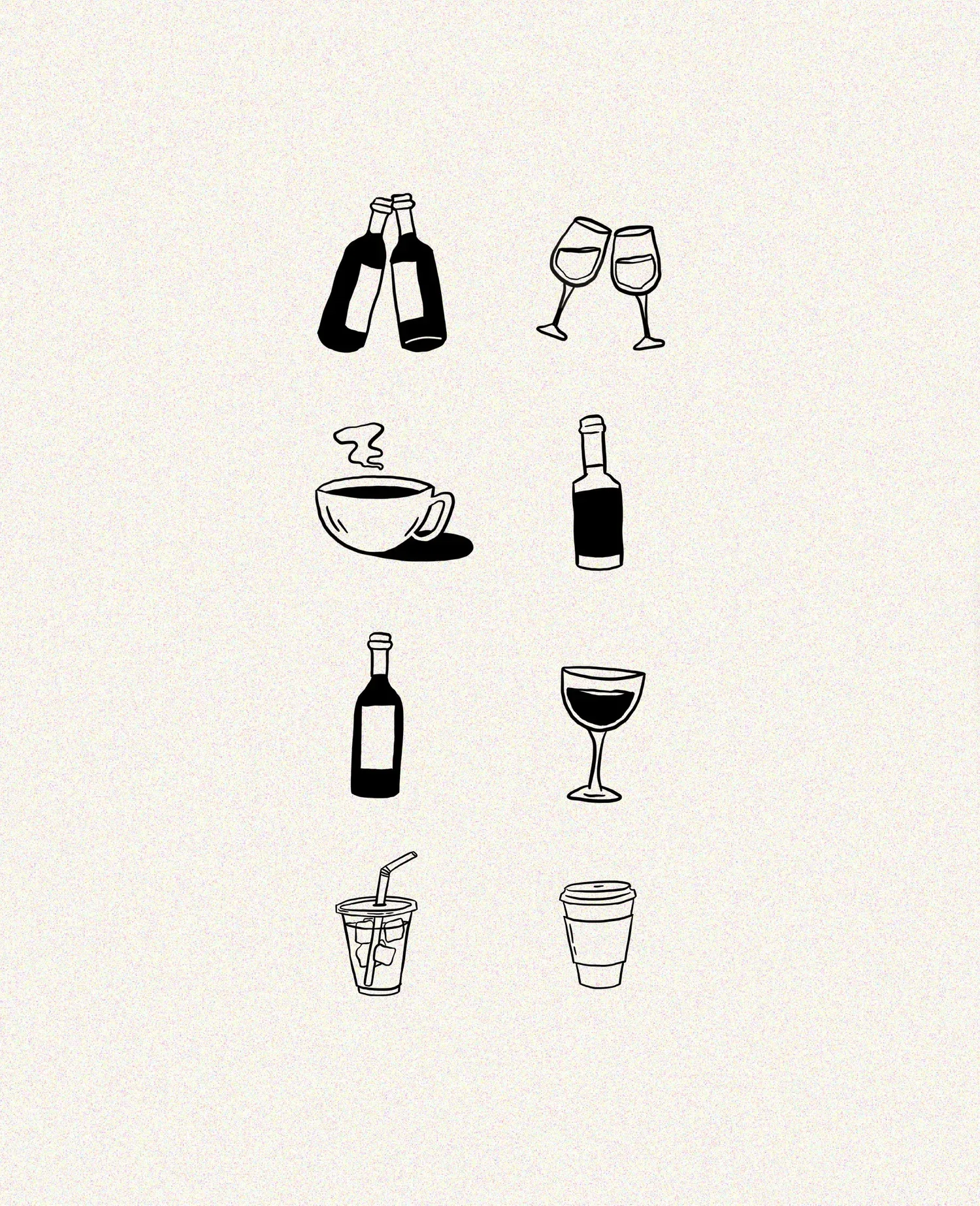
Custom Illustrations
Rather than relying on decorative graphics, we designed a bespoke illustration system that visualizes the experiences Apaw aims to create—people gathering, connecting, and enjoying good food together. Paired with simple illustrated food and beverage icons, the clean hand-drawn style gives the brand a distinctive visual language that feels warm, approachable, and unmistakably human.
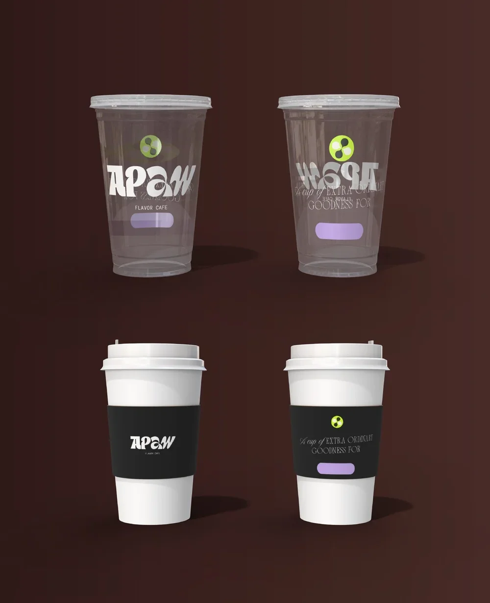
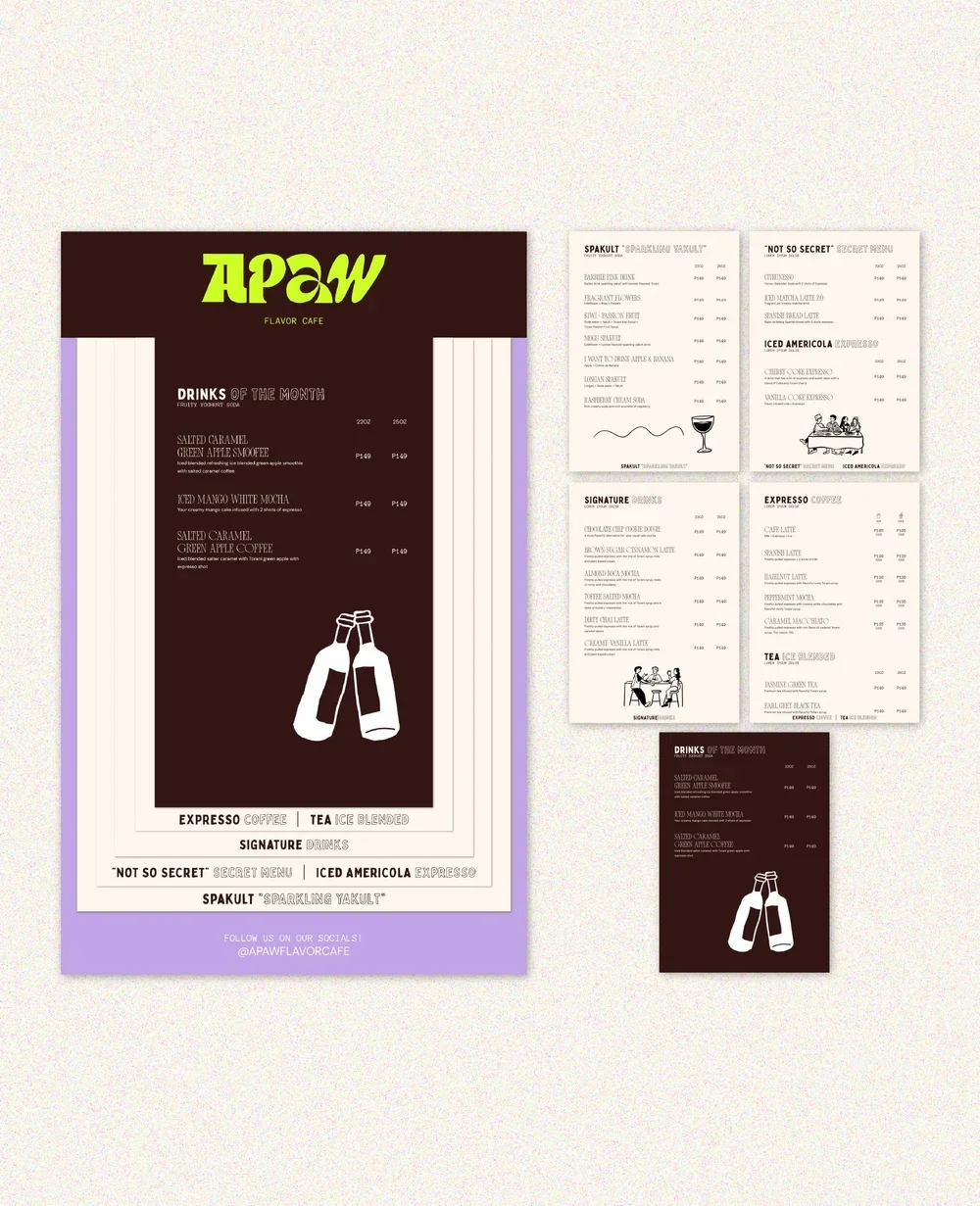
Cup and Menu cOLLATERAL Design
“They are more than just a designer-they are a visionary strategist and a brilliant collaborator who genuinely cares about their clients' growth.”
My journey with Hark Studio goes all the way from when the studio opened 6 years ago (It was a different name back then, and now to Hark!)
Ever since I started my business journey, they have been the only one l've trusted to bring my visions to life. From the branding of La Taza (which just turned 6!) to Apaw Flavor Cafe, 7AM Pilates + Cafe, and now Day One Wellness Studio, they have always been there every step of the way.
I love how they always perfectly captures what my mind can't execute. But more than just beautiful designs, she taught me the heart of entrepreneurship: that businesses aren't just there to earn money, but to solve real problems and answer people's needs. Because of them, I learned that a business with a solid strategy will always have a clear direction and stay on track.
They are more than just a designer-they are a visionary strategist and a brilliant collaborator who genuinely cares about their clients' growth.
I'm so incredibly grateful to work hand-in-hand with them through all my ventures. If you want a brand that has both a beautiful face and a solid soul, Hark is the absolute best!
- Monique, Founder and CEO of La Taza, Apaw Flavor Cafe, 7AM Pilates Studio + Cafe, Day One Wellness Studio