
Your Everyday Reset
Anaya Aesthetic Studio
Brand Strategy & Identity
Beauty & Aesthetics
Minimalist, Clean, Youthful
Project ScopeIndustryStyleThe ChallengeThe aesthetics industry often feels intimidating. Many clinics position themselves as exclusive, clinical, or aspirational—making everyday women feel like quality care is either out of reach or reserved for a select few.
Anaya wanted to challenge that perception.
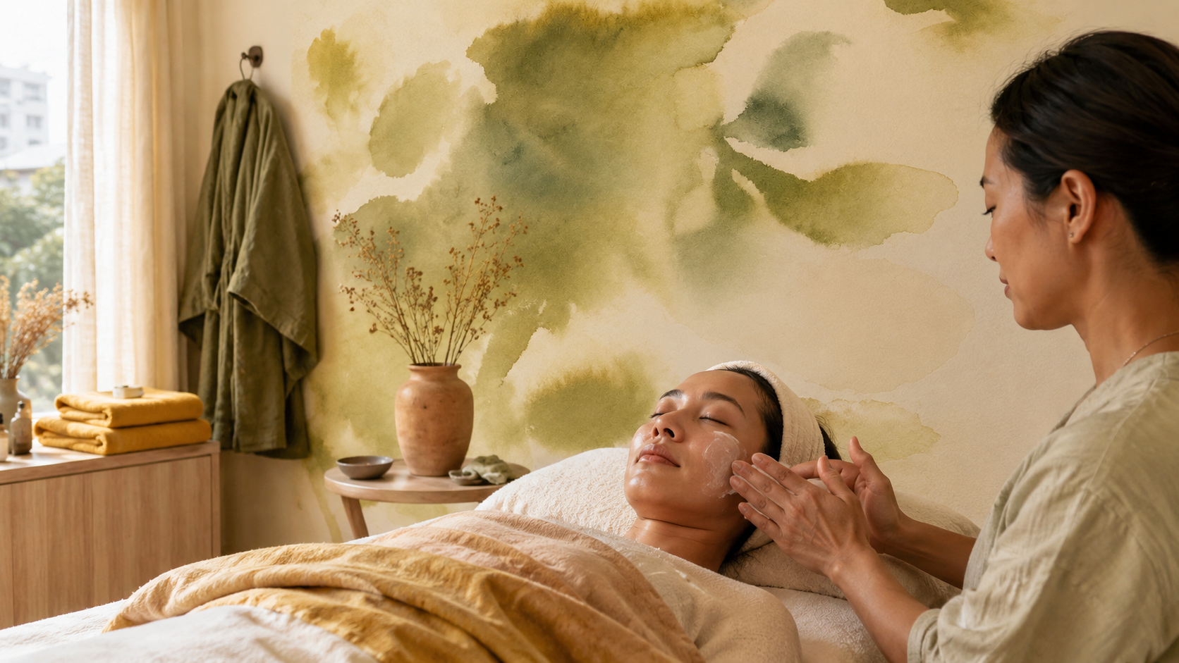
As an aesthetic studio with multiple locations across Metro Manila, its mission was to make professional aesthetic care more accessible for the everyday woman—from students to young professionals and busy working women. The challenge was to create a brand that felt warm, youthful, and approachable while still communicating professionalism and trust. It also needed to express affordability without ever feeling cheap, proving that accessible care and exceptional quality can exist together.
The solutionRather than positioning Anaya as another luxury aesthetic clinic, we built a brand around accessible confidence. Our strategy was to shift the conversation from exclusivity to empowerment—creating a brand that tells women they don't have to spend a fortune or fit a certain mold to invest in themselves.
Every touchpoint was designed to reinforce the idea that aesthetic care should feel approachable, encouraging, and part of everyday self-care rather than an occasional luxury. The result is a brand that resonates with students, young professionals, and working women alike, proving that affordability and premium care don't have to exist at opposite ends of the spectrum.
Brand Palette for the everyday woman
We curated a palette that feels calming, approachable, and quietly elevated. Earthy greens establish a sense of trust, wellness, and natural beauty, while dusty blue introduces calm and reassurance. Soft clay blush adds warmth and femininity without leaning overly delicate or trendy, creating a balanced palette that feels youthful yet timeless.
Together, the colors reinforce Anaya's belief that premium aesthetic care can feel welcoming, accessible, and made for everyday women—not just a select few.

cUSTOM Backgrounds
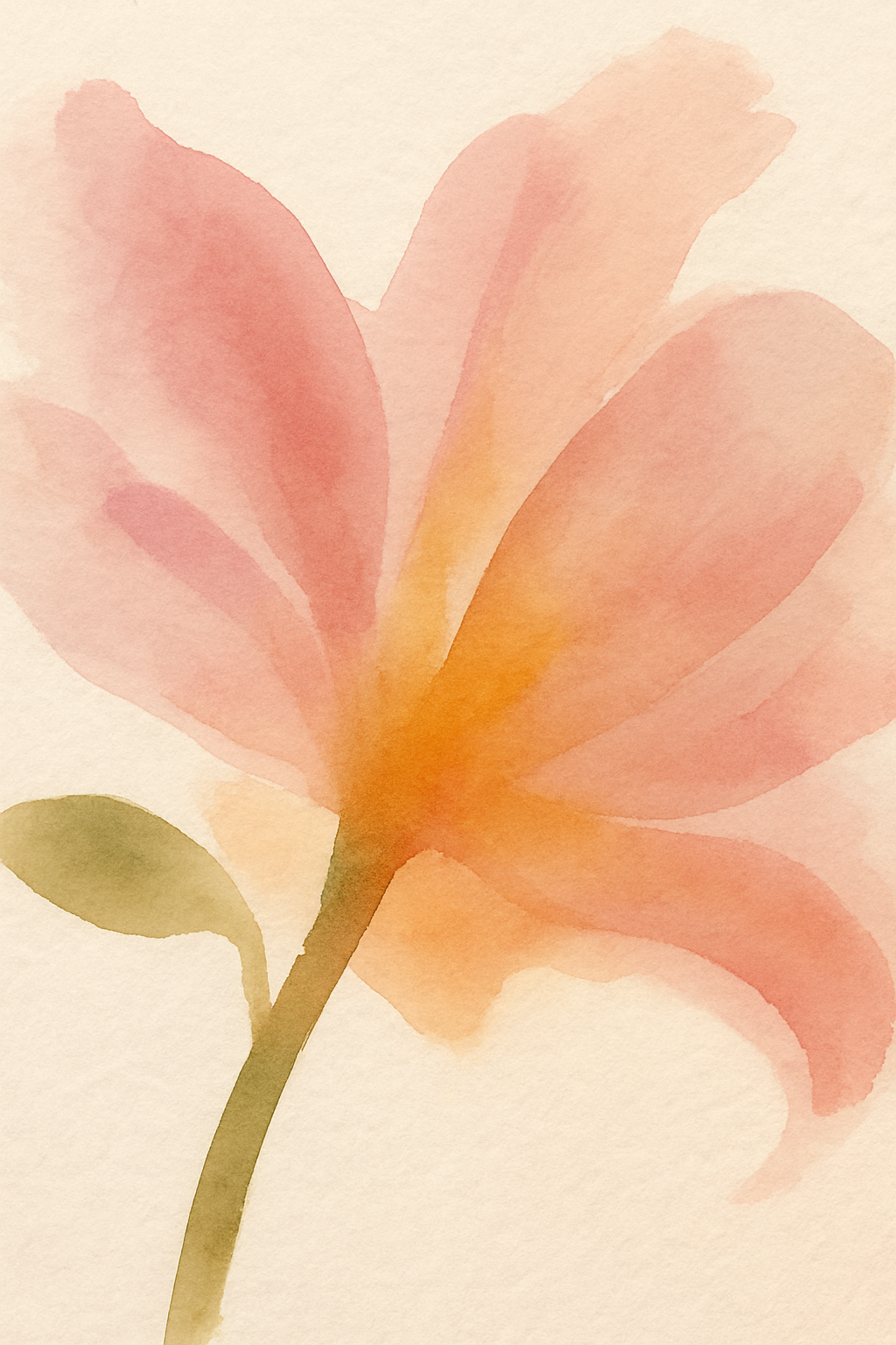
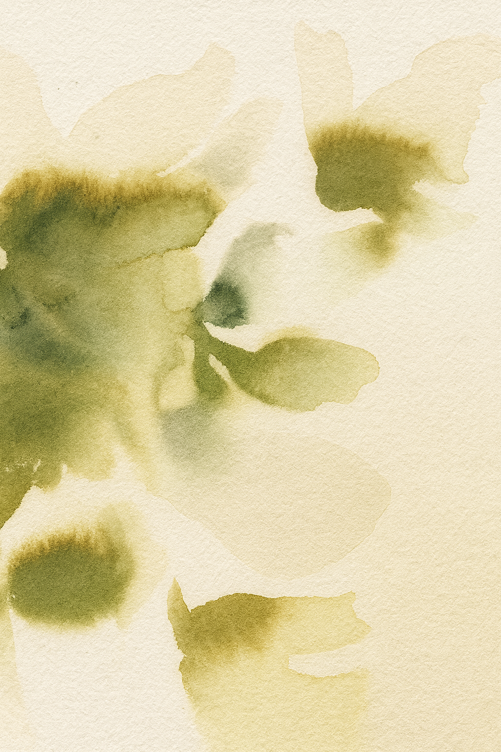
To soften the brand while reinforcing its premium positioning, we introduced a collection of floral-inspired graphics and watercolor textures that feel organic and handcrafted.
The patterns were designed to extend seamlessly across packaging, social media, printed materials, and the physical clinic experience—bringing warmth and consistency to every touchpoint.
Sample Posters
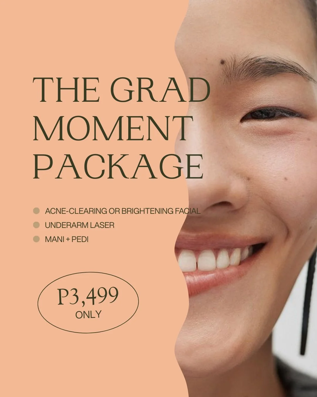
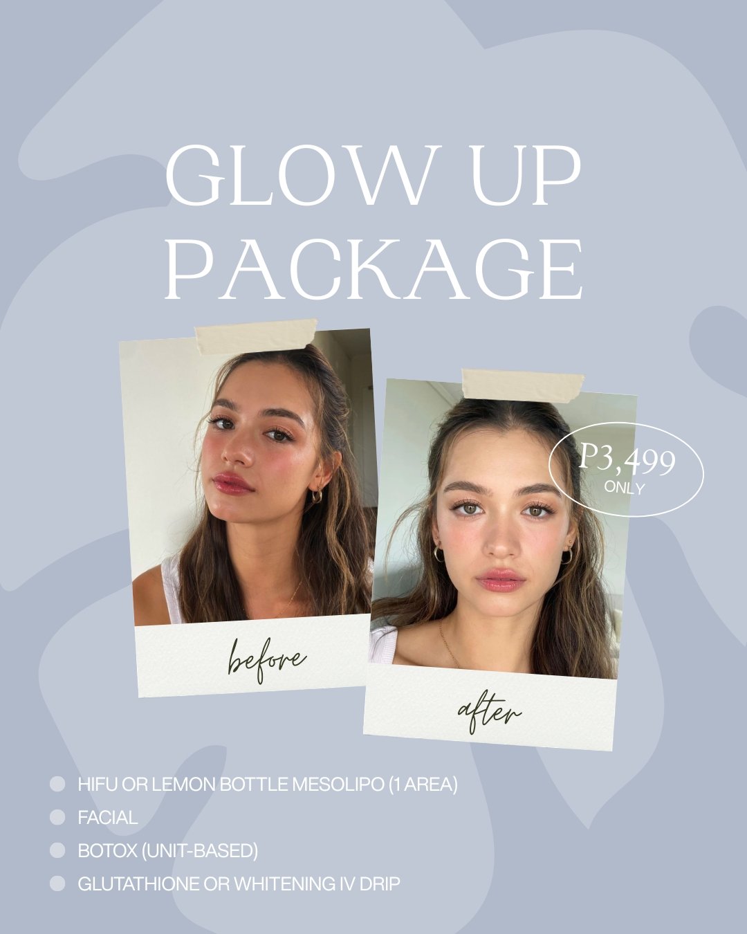
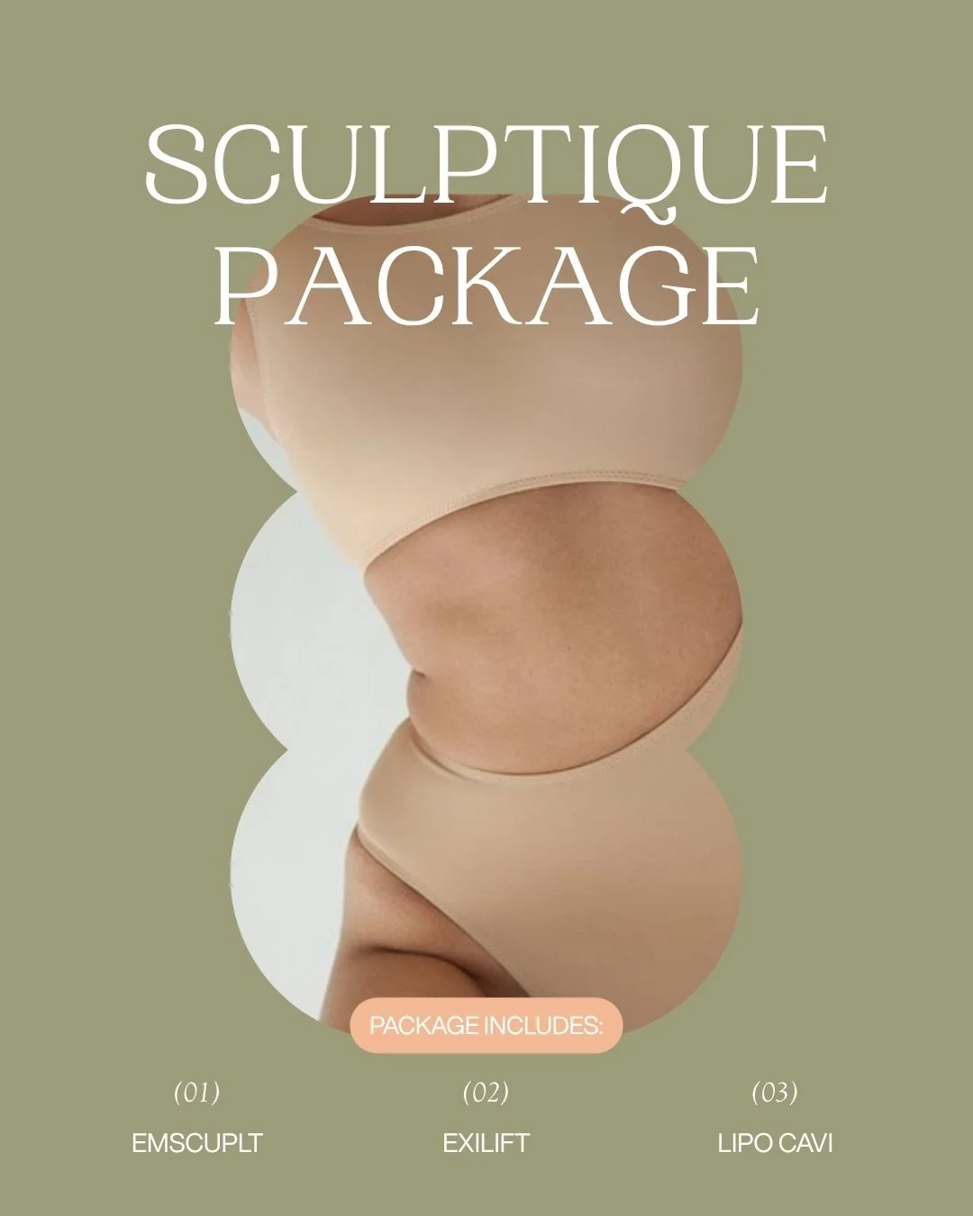
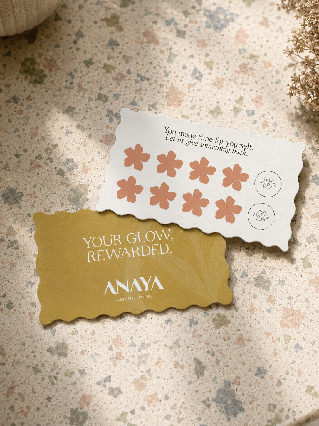
Wavy Die-Cut Edges to echo the brand's soft, feminine personality
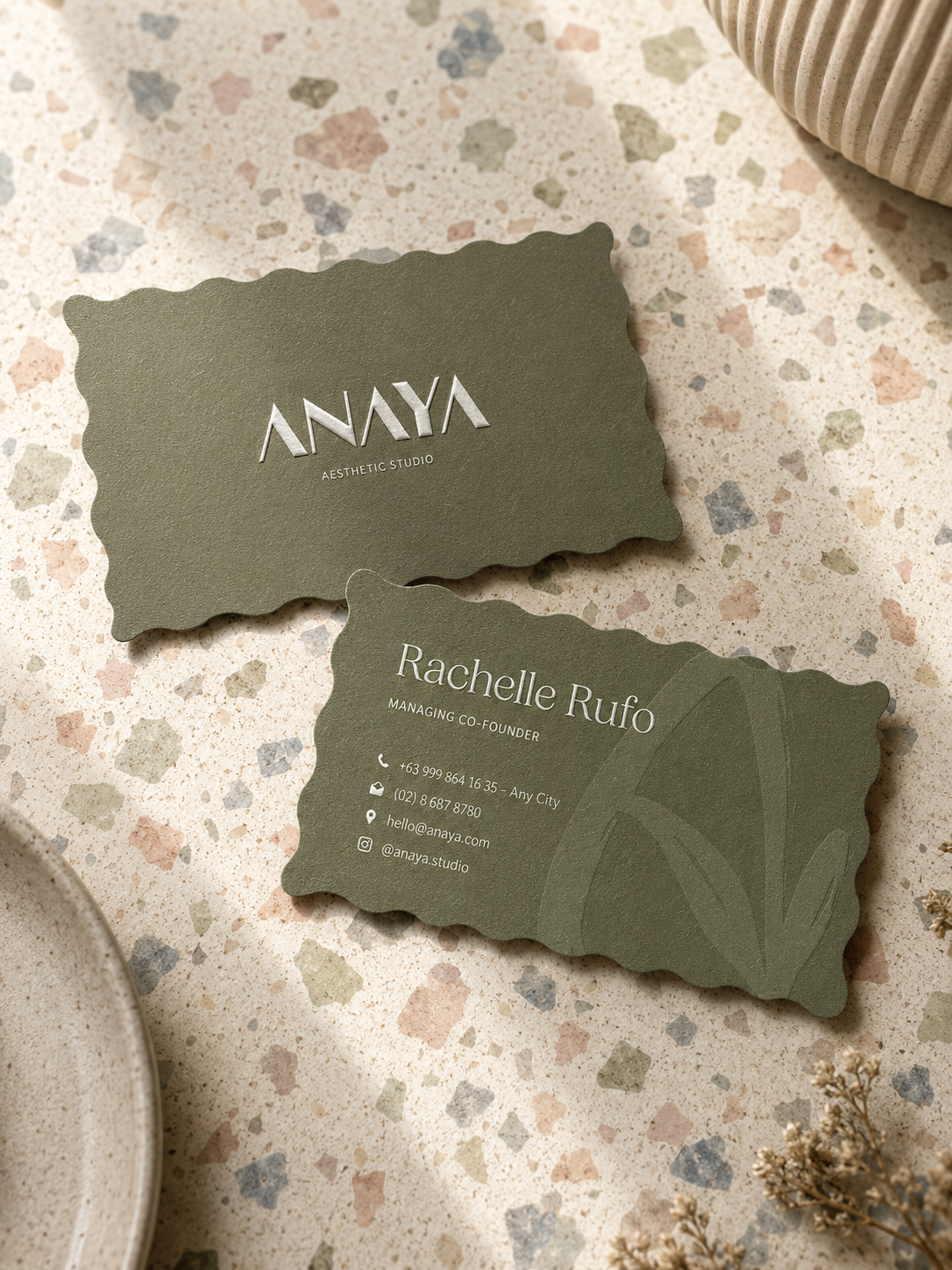
Business Card
Loyalty Card
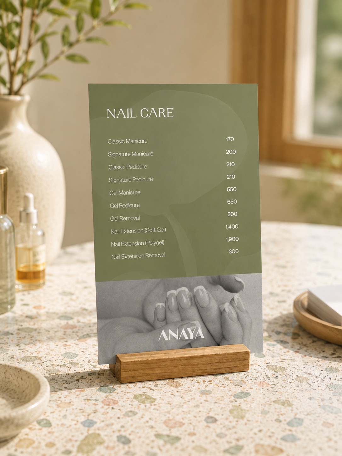
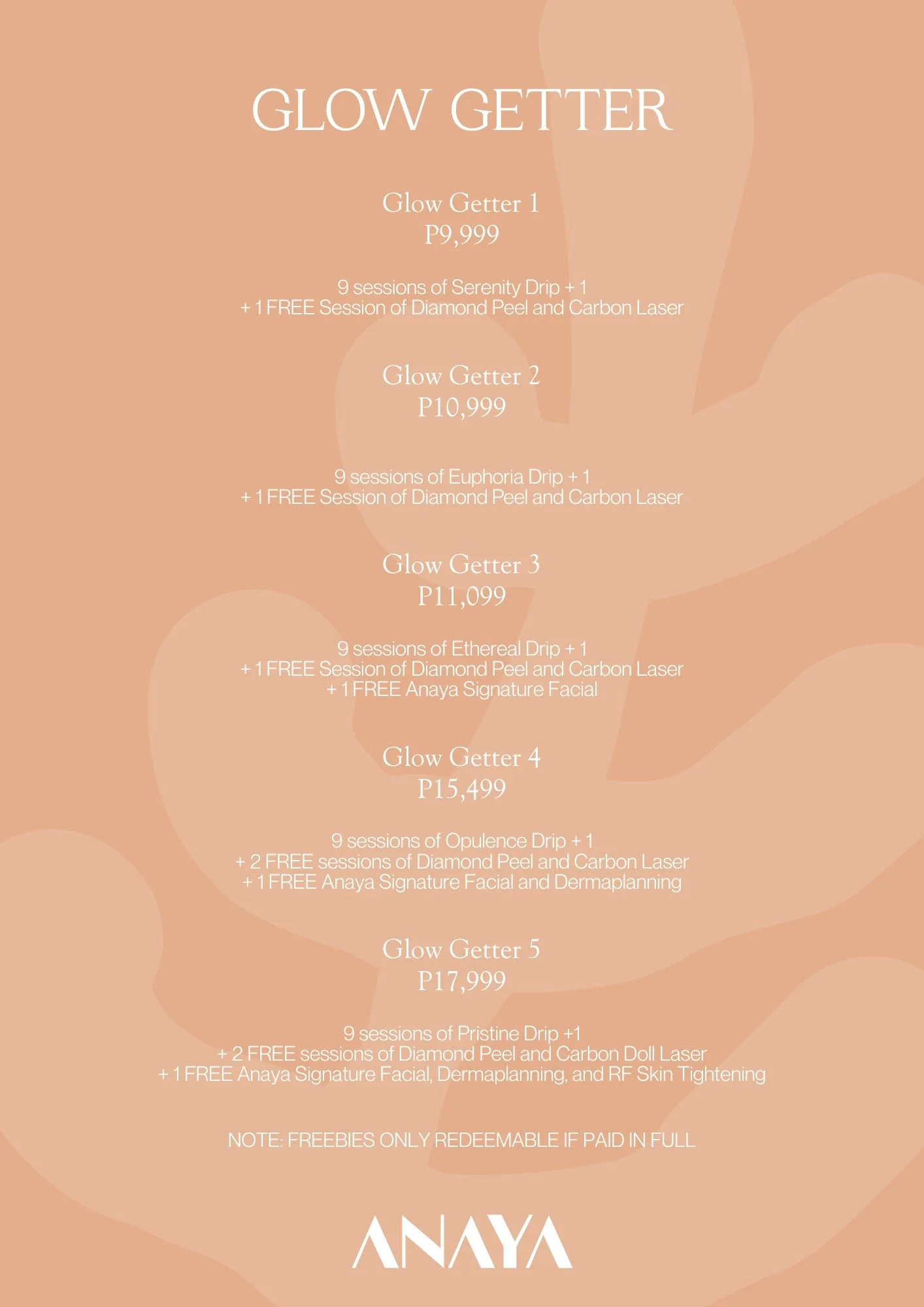
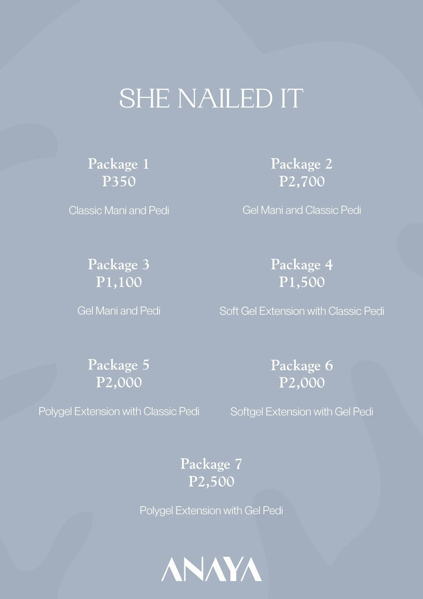
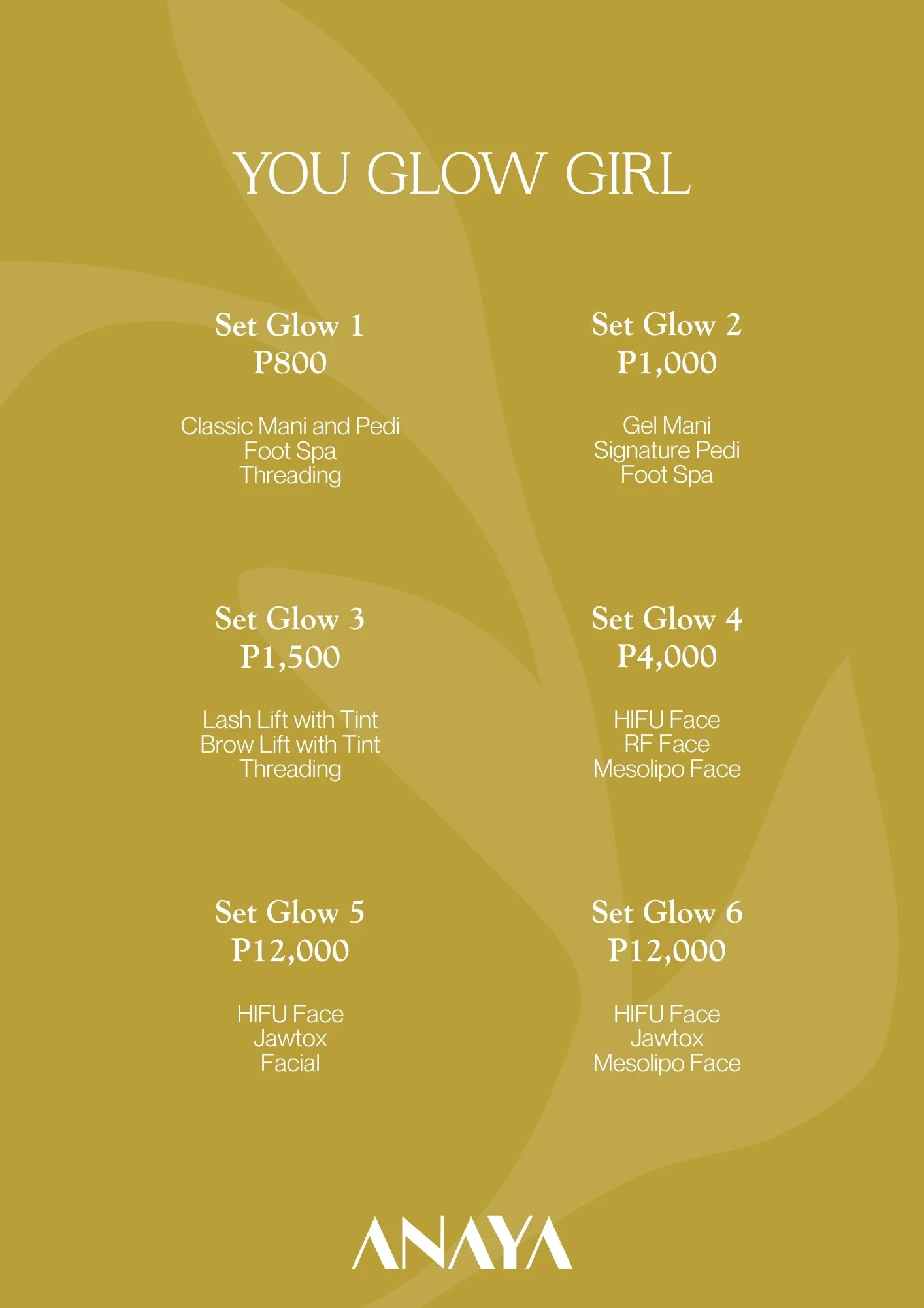
Pricelist Design
“Hark Studio has played a significant role in Anaya’s growth. ”
Working with Hark Studio has been one of the best decisions we’ve made for Anaya.
As a fellow mom entrepreneur, Hark truly understands what a growing brand needs. They don’t just create beautiful designs, they help define your brand strategy and identity, giving you clarity on who you are and where you’re going. That foundation has been invaluable in every decision we’ve made.
The entire team is incredibly hands-on, detail-oriented, and genuinely invested in the success of their clients. Kara, as Creative Director, is personally involved throughout the process, and her passion and expertise shine through in everything she does.
Hark Studio has played a significant role in Anaya’s growth. They are more than a branding agency they’ve become a true business partner, helping us navigate our journey with confidence and purpose.
What I appreciate most is how easy they are to work with and how aligned we are in the values we uphold. It’s rare to find a team that combines creativity, strategy, and genuine care so well.
Thank you, Hark Studio, for believing in our vision and helping bring it to life. Wishing you and your team even more success and abundant blessings.
- Kim, Founder of Anaya Aesthetic StudioI'm absolutely loving our clinic's recent brand refresh! The overall look feels so much cleaner, more elevated, and more premium, while still maintaining that soft and approachable feel. The new visual identity is beautiful—minimal, sophisticated, and incredibly cohesive. It doesn't feel like they simply changed the logo— you can really tell the branding was approached with much more intention and is now better aligned with the image of a modern aesthetic clinic.
As someone who appreciates good branding, I know how much of a difference this makes in people's first impressions. It instantly builds more trust and confidence, and the brand is much more recognizable. It feels polished and professional without losing its warmth. Definitely worth it!
- Jus, Co-Founder of Anaya Aesthetic Studio